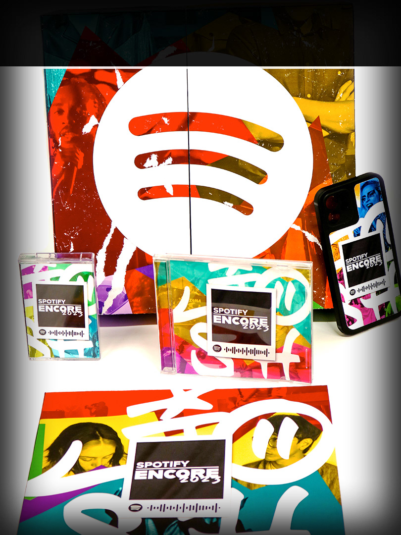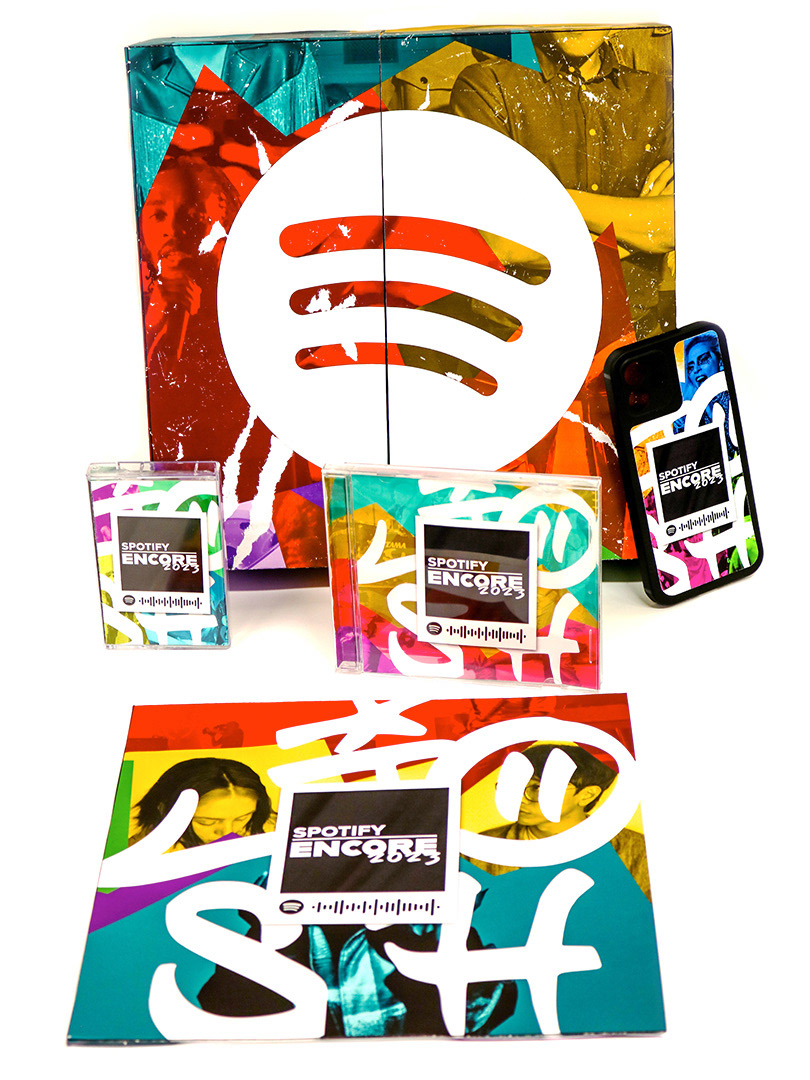
The goal of this project was to create a concept as well as marketing graphics and merchandise for We Can Survive Audacy's annual music celebration to raise funding for mental health resources and a celebration of life.
Inspired by Synesthesia, a condition where people have can have a visual sensory reaction to sound, the concept Rough Synesthesia seeks to visualize the feeling of sound and the vibrancy of music. A very rough and gestural style to illustrate the energy, movement, and life of music. Focused more so on the beauty of movement rather than being clean and perfect to go with of mental health awareness.
Typography
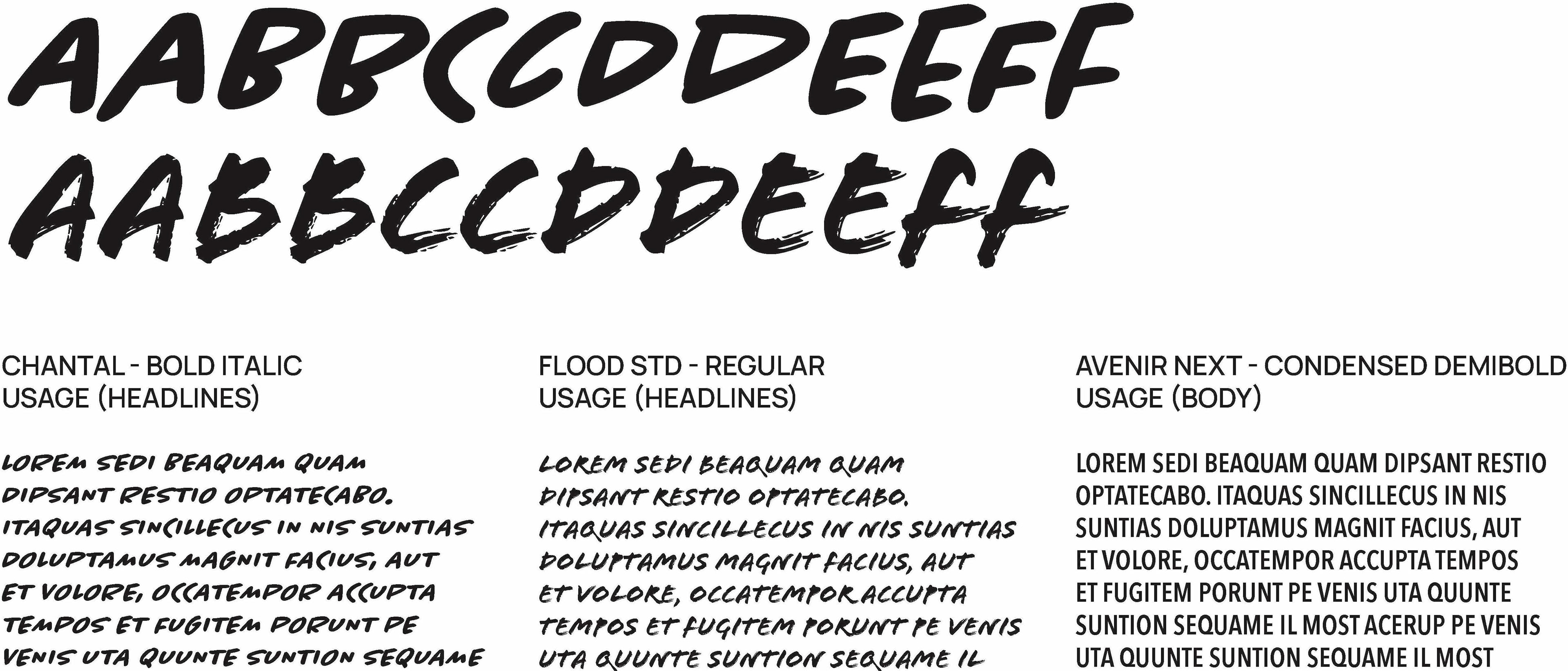
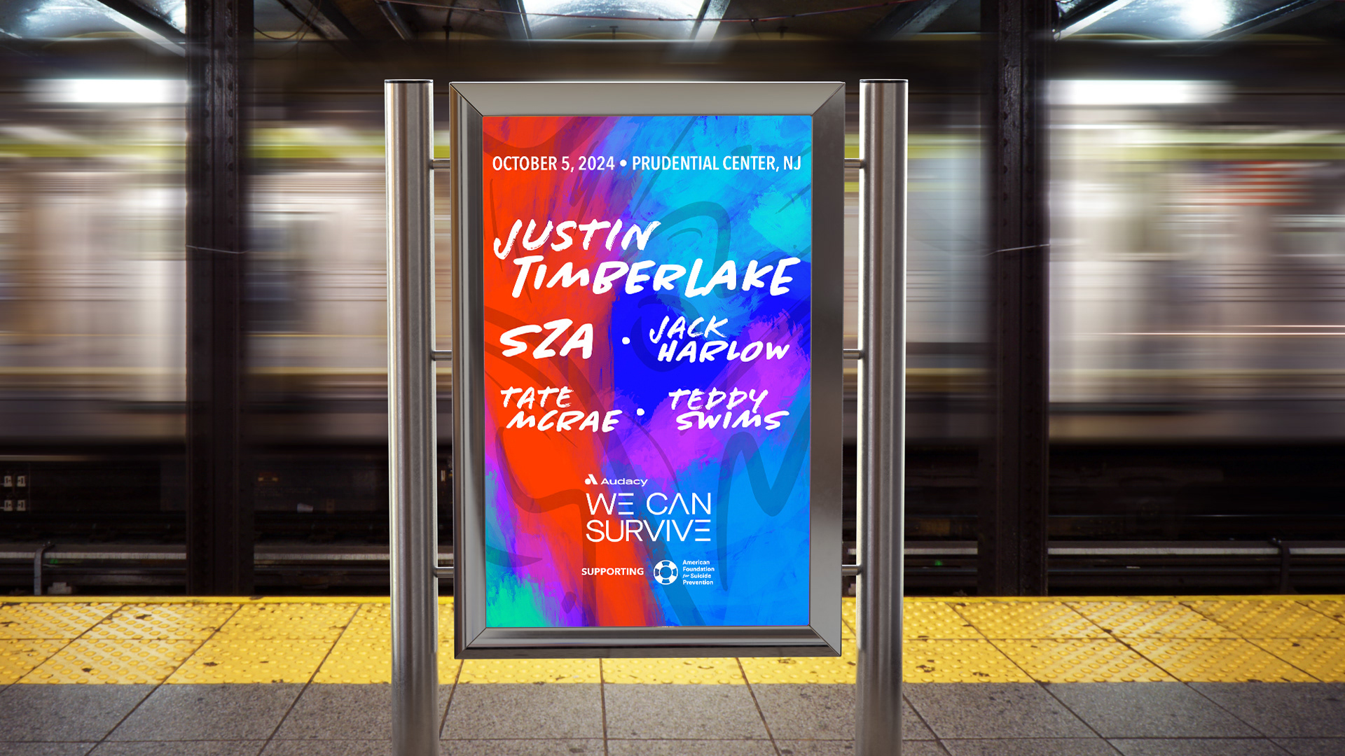
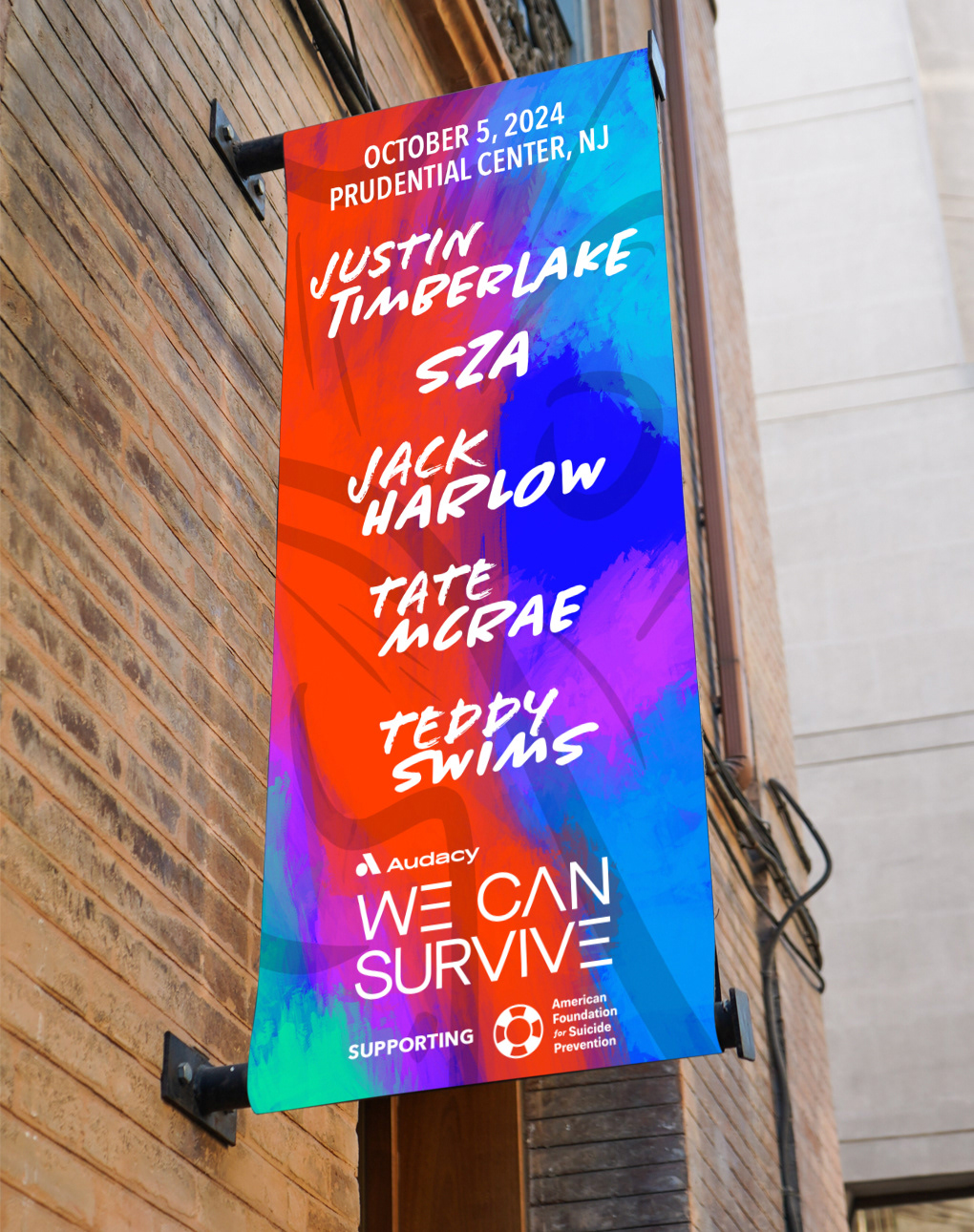
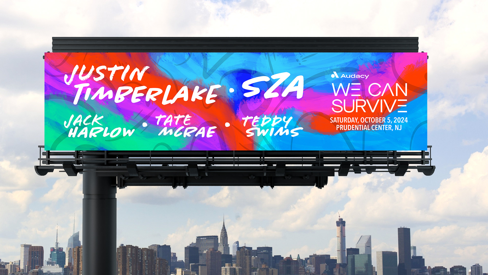
A combination of two handwritten typefaces, Chantal and Flood, were chosen for the headliners to work with the two brush types used for the background and to continue the overall concept. Avenir was used for body copy as the linear geometric nature of the We Can Survive logo.
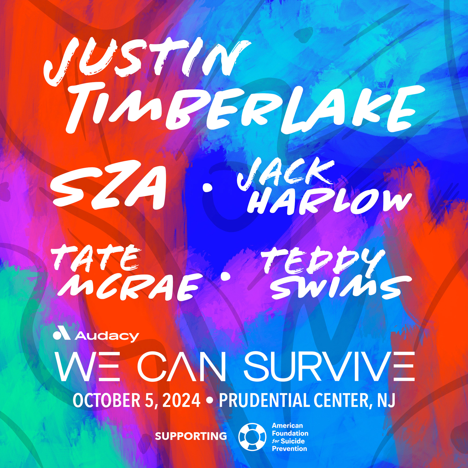
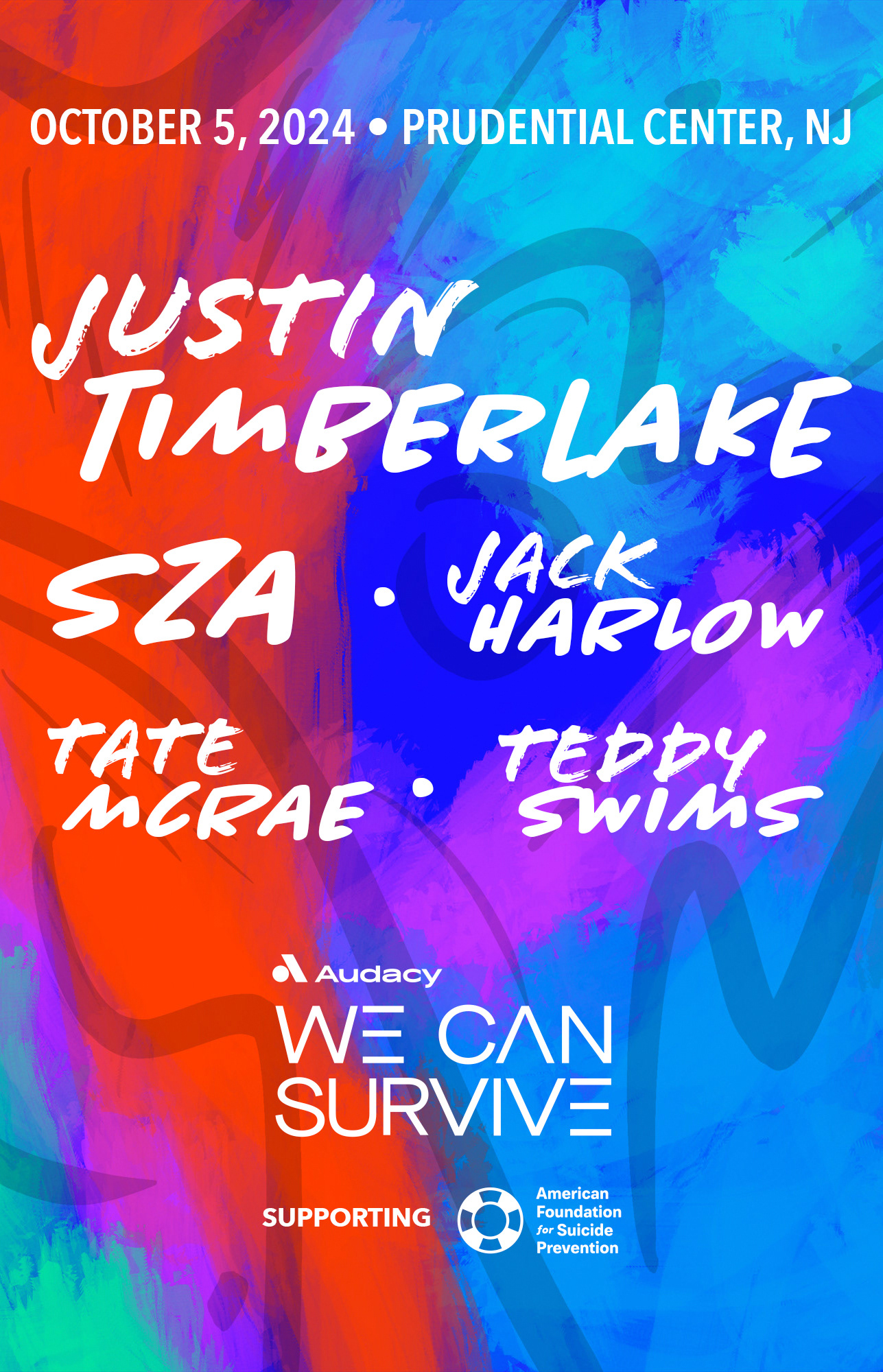
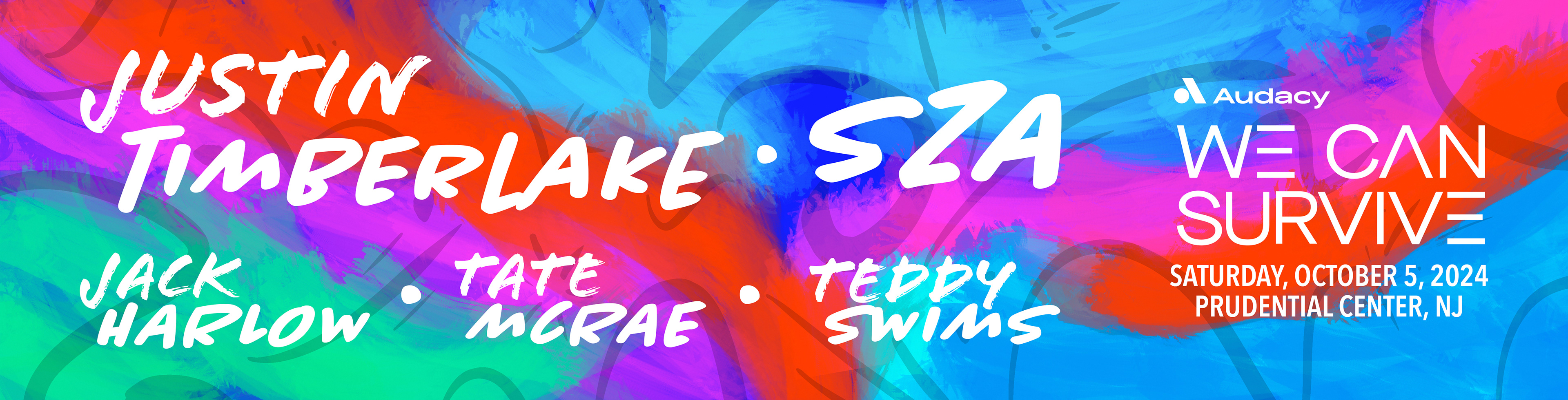
Line up graphics
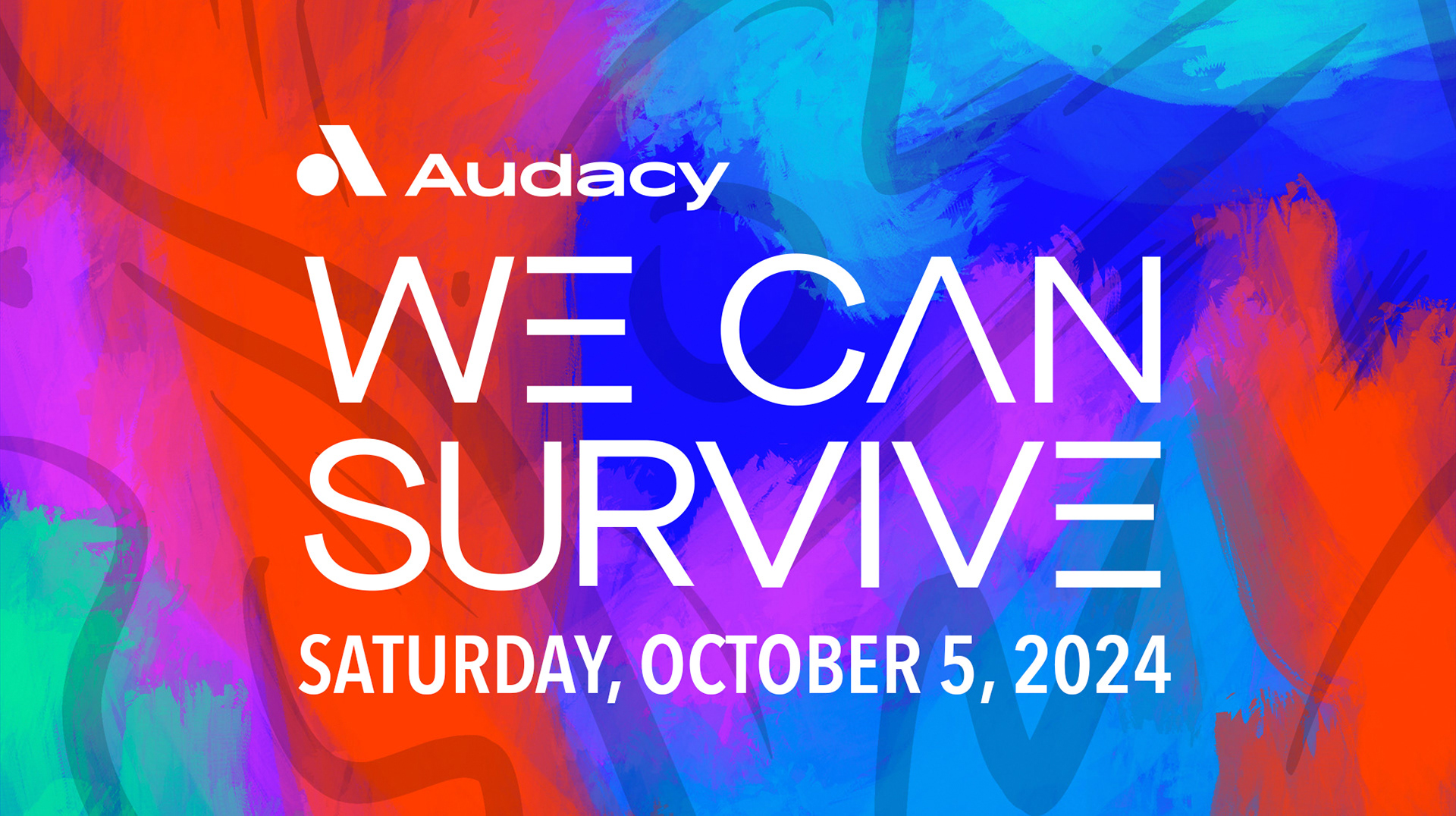

The color palette is a combination of vibrant reds, blue greens and red violets. This unconventional color palette was chosen to convey the theme of the beautiful imperfection of mental health, while still maintaining the exciting nature of a celebration.
The backgrounds were illustrated by me by using a jagged dry brush in procreate to lay down colors and then overlaying gestural lines with a smooth gel pen brush in order to simulate the feeling of music.
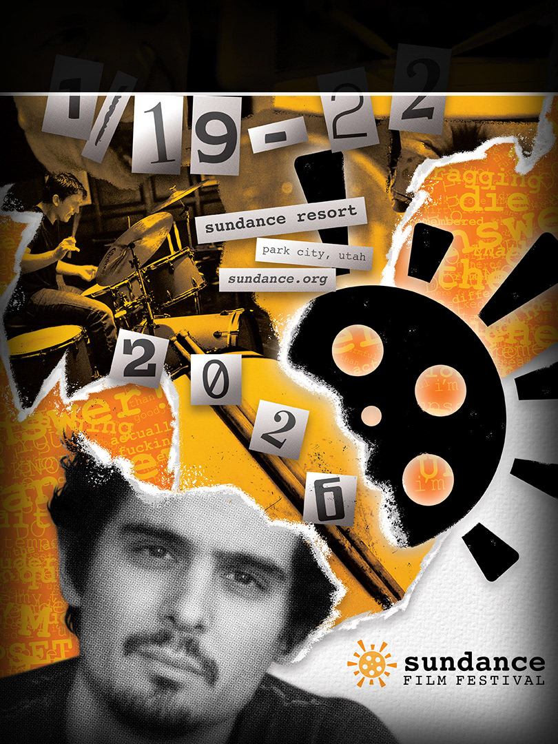
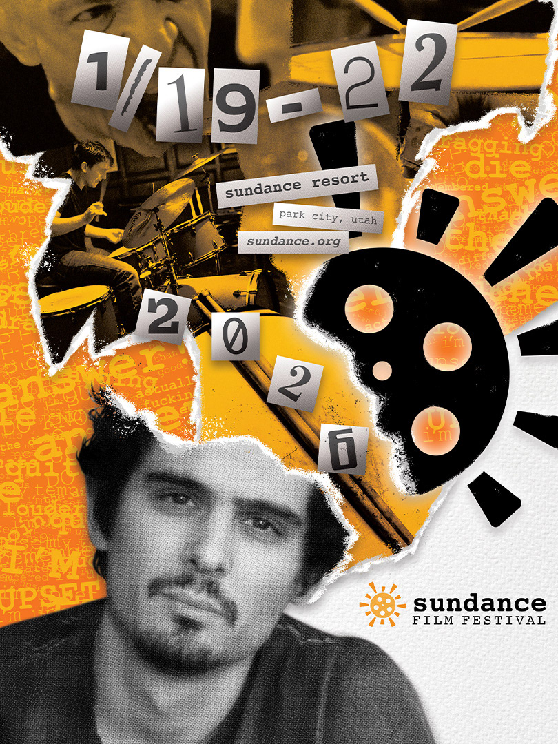
Artist graphics
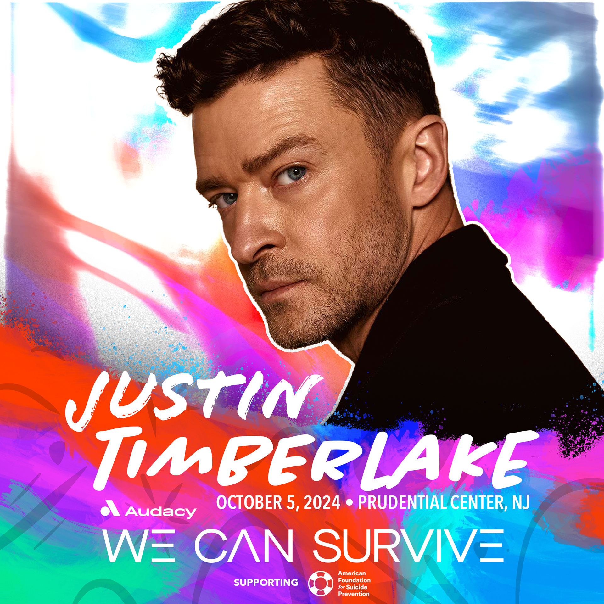
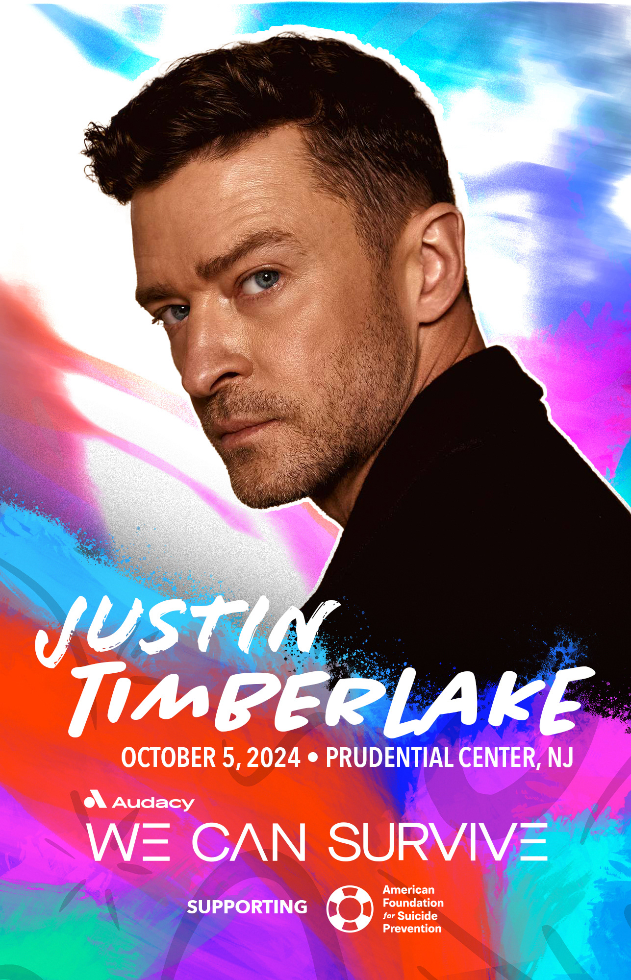
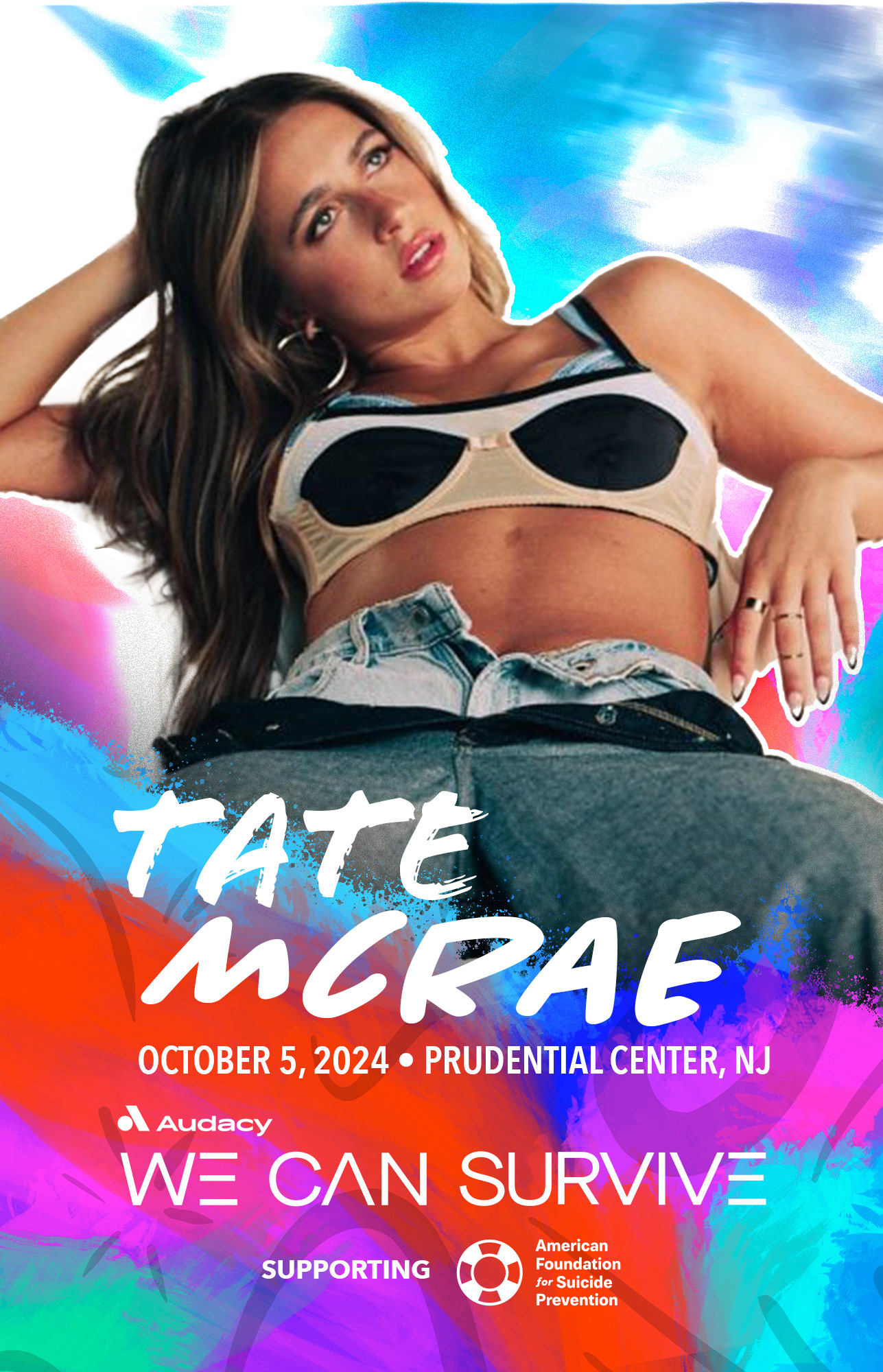
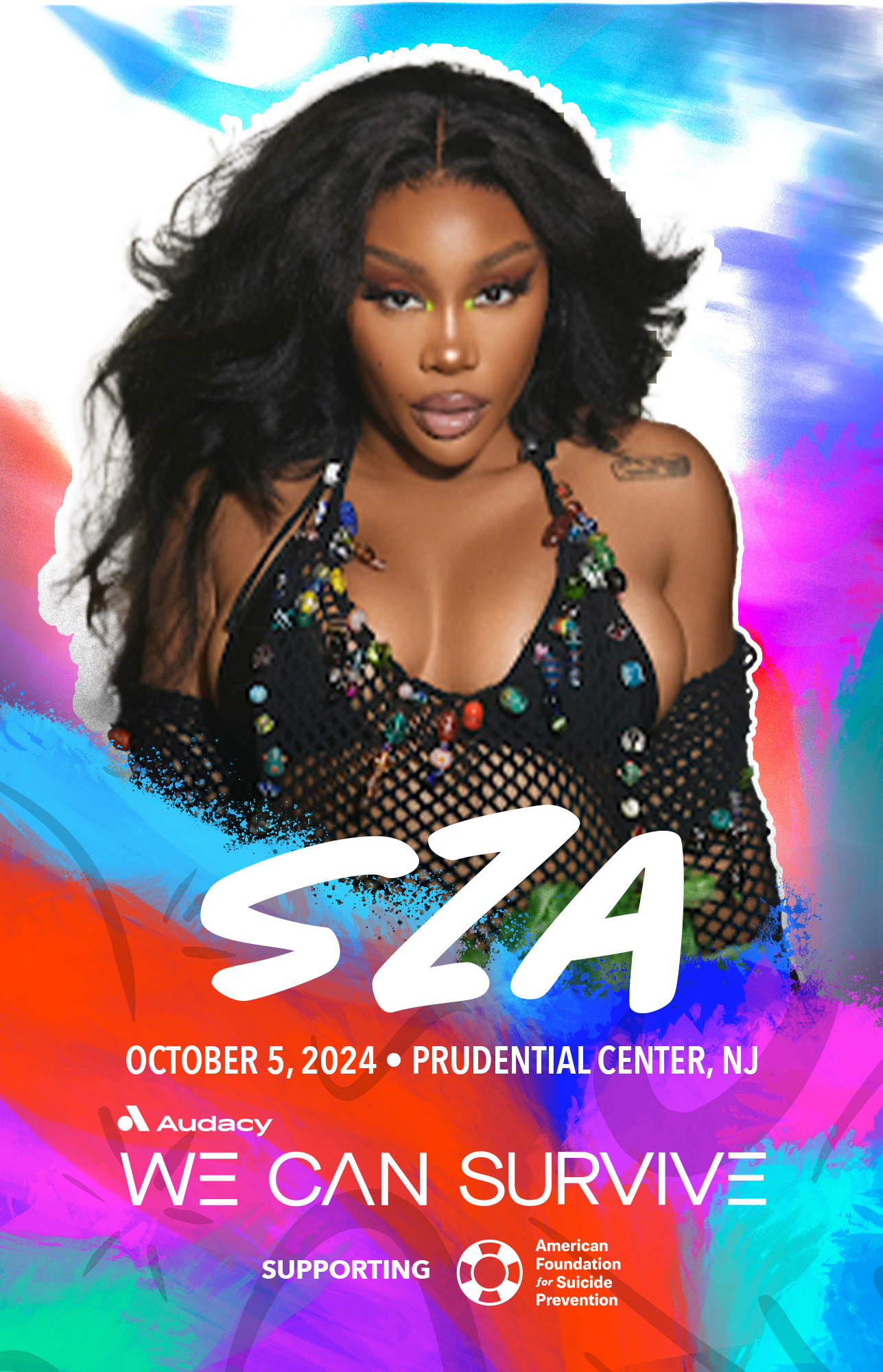
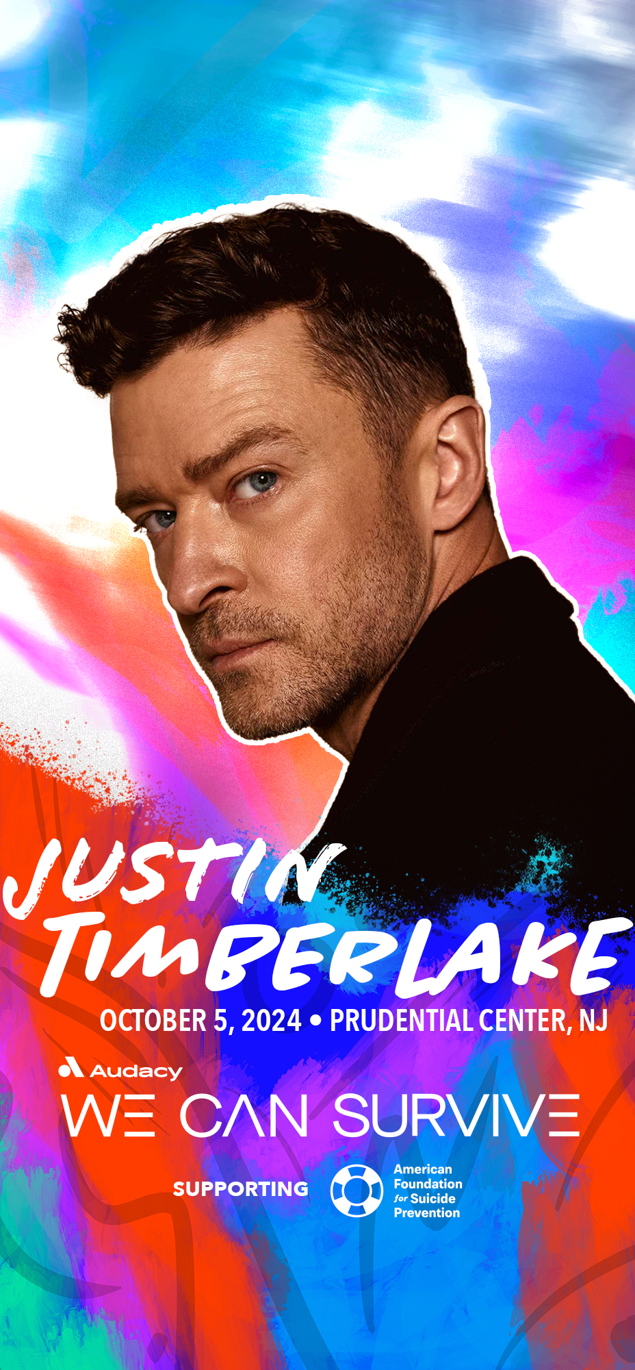
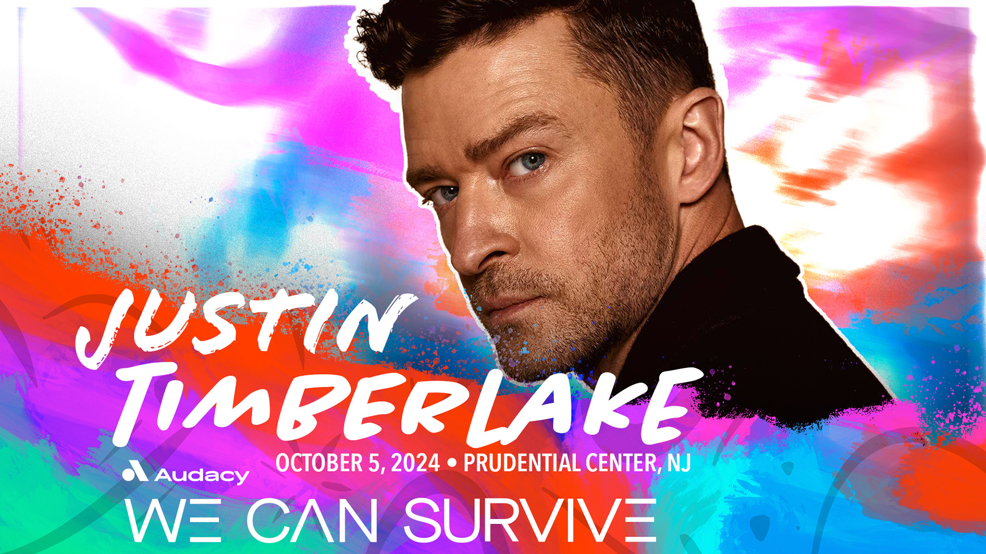
The artist graphics have the headliners behind a glowing light paint version of the main background to convey the movement of the bright lights typically seen at music festivals. Furthermore, layered on top of the artist photo is a Jackson Pollock styled paint splatter with the info seemingly drawn on top to give a sense of depth and dynamism.
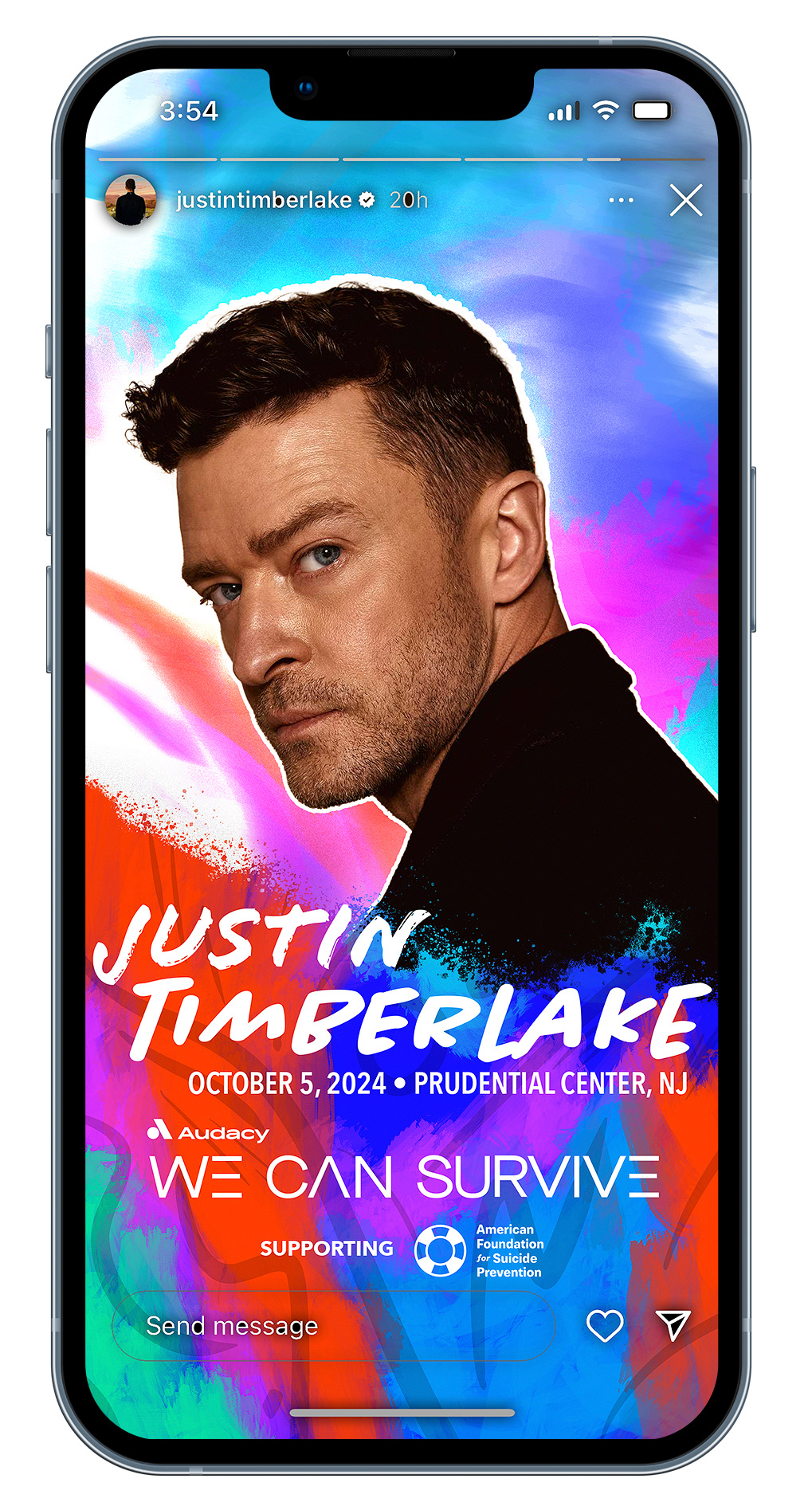
digital in-situ


out of home

on site
hoodie
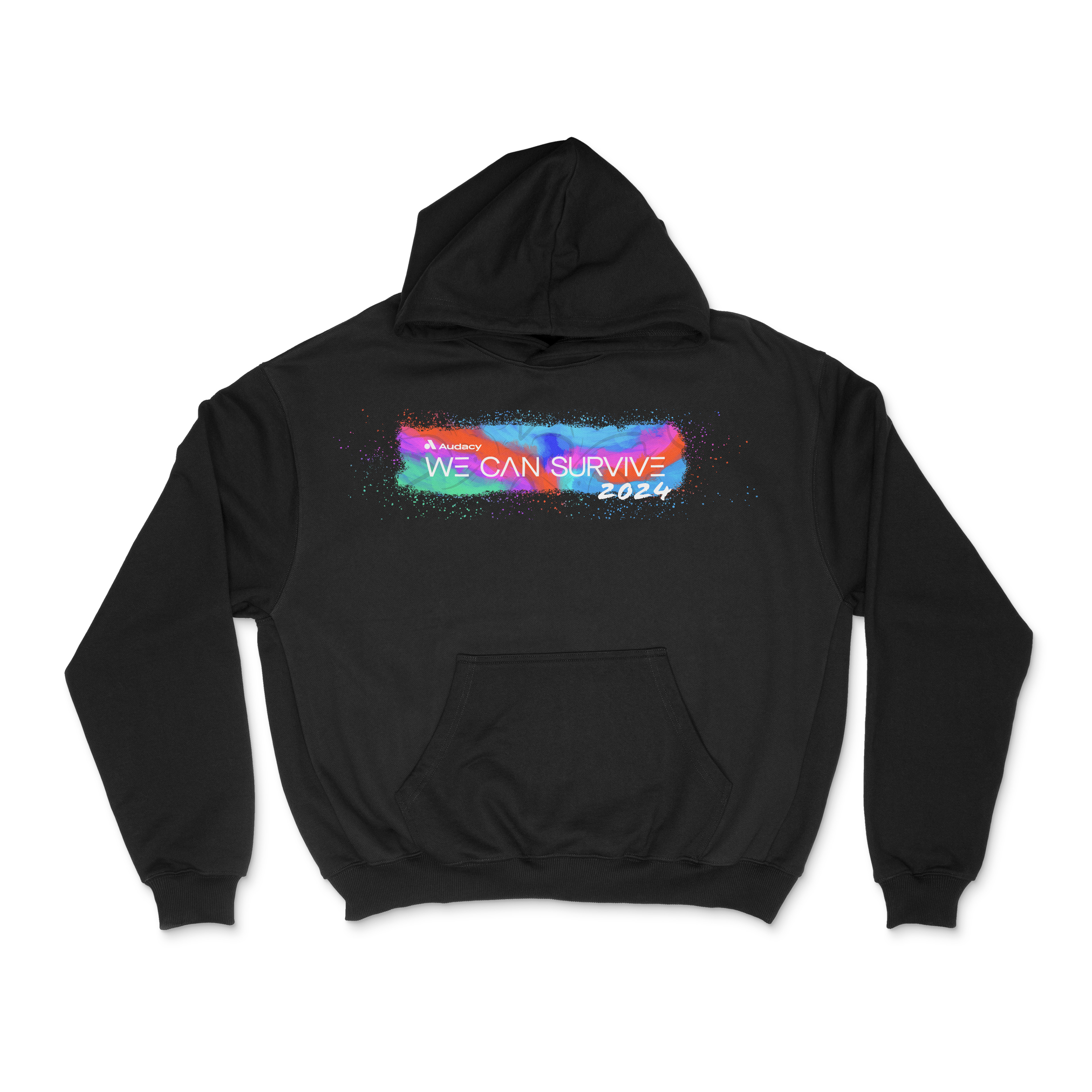
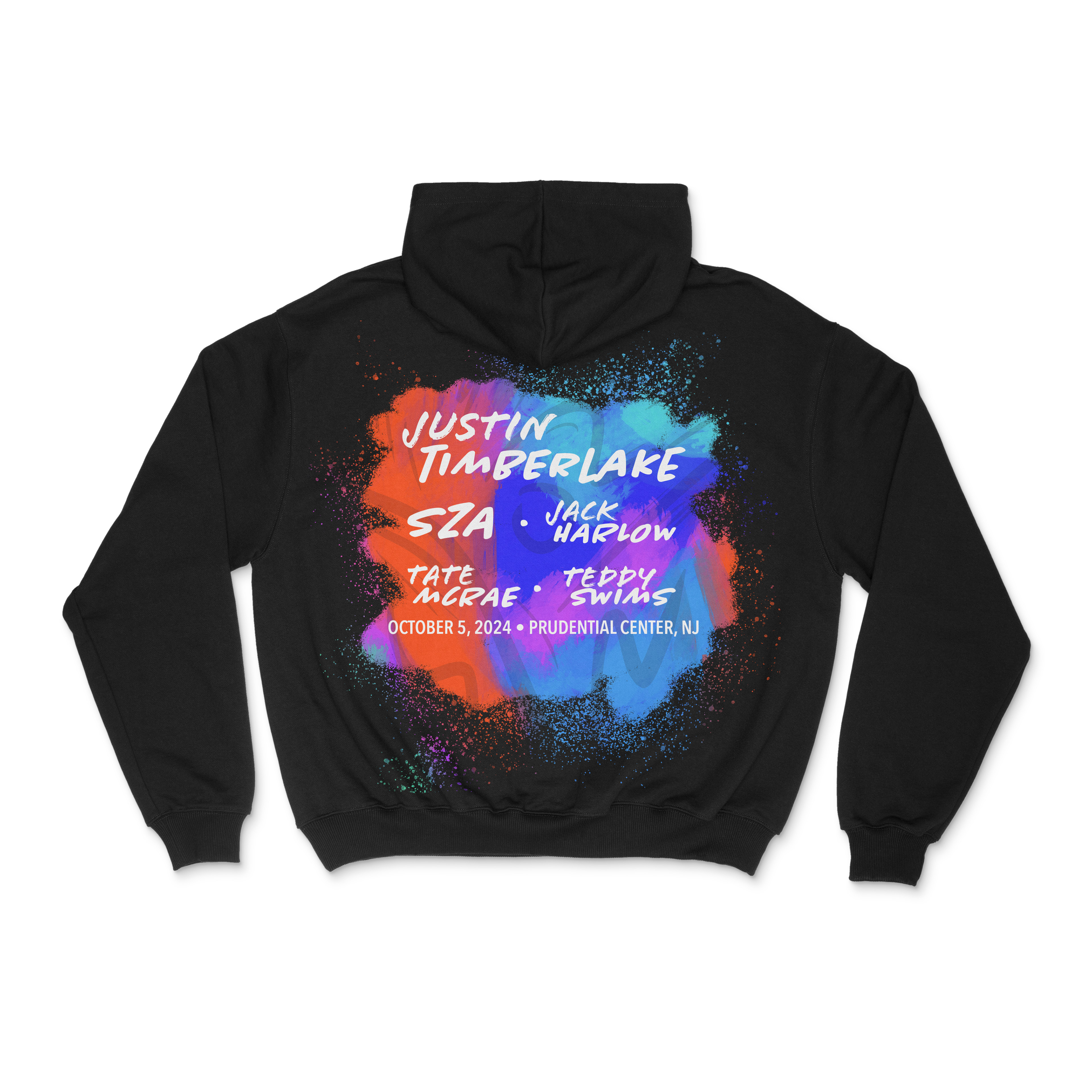
Inspired by hype beast fashion and other festival hoodie designs, the hoodie has a simple front with the line up listed on the back. The information listed such as the line up, date, and location was added for a collectible quality to the piece to signify which specific artists they saw and day they went.
t-shirt
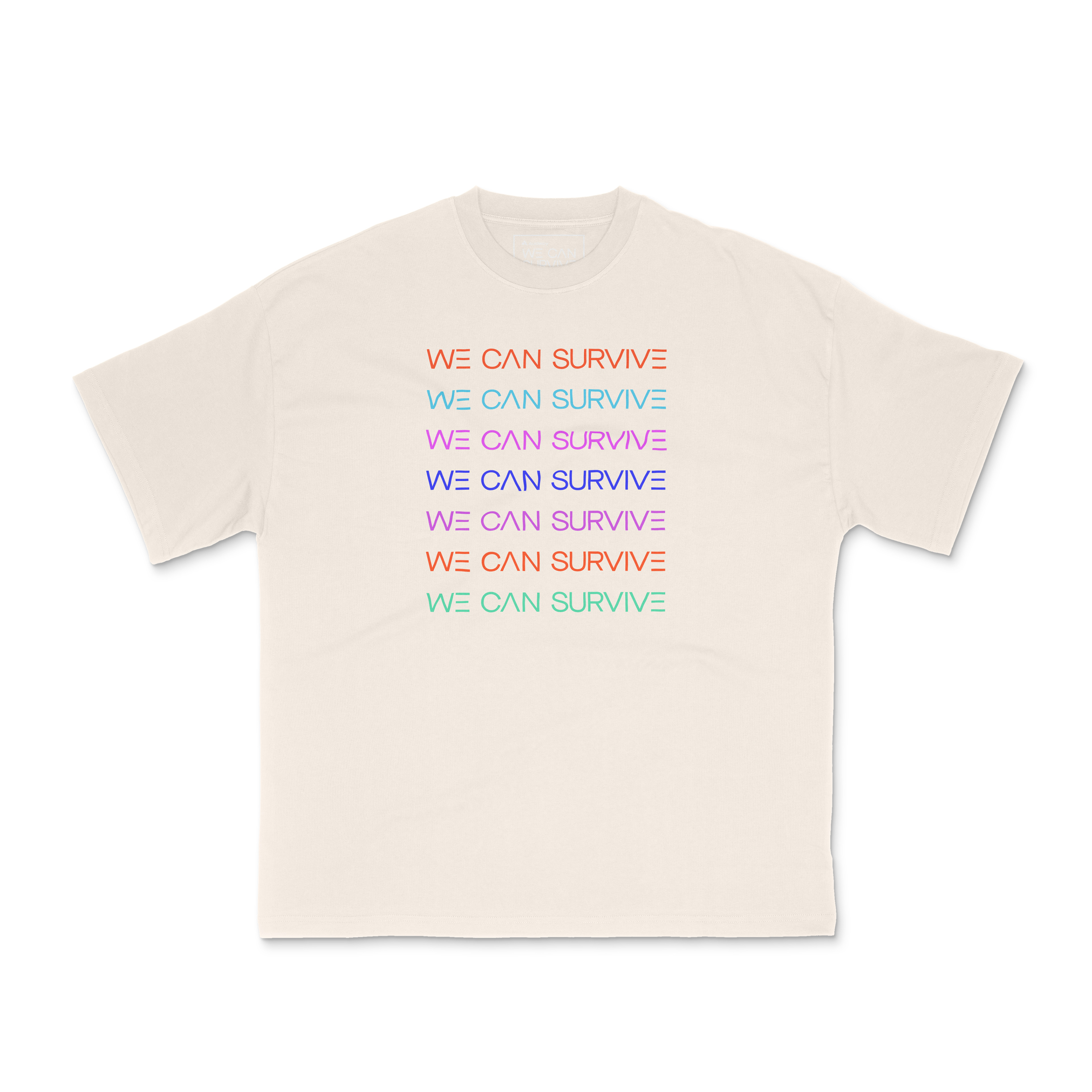

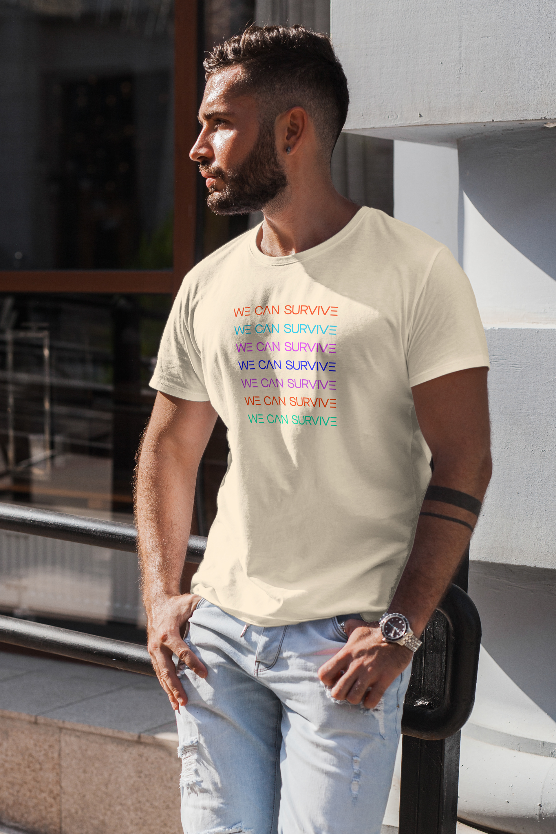
Inspired by high fashion the front has the We Can Survive logo repeated in the different colors used for this concept. The back has the Audacy logo blown up in black slightly revealing the colorful paint background used throughout this concept to allude to Audacy's "Talk Away the Dark" campaign.
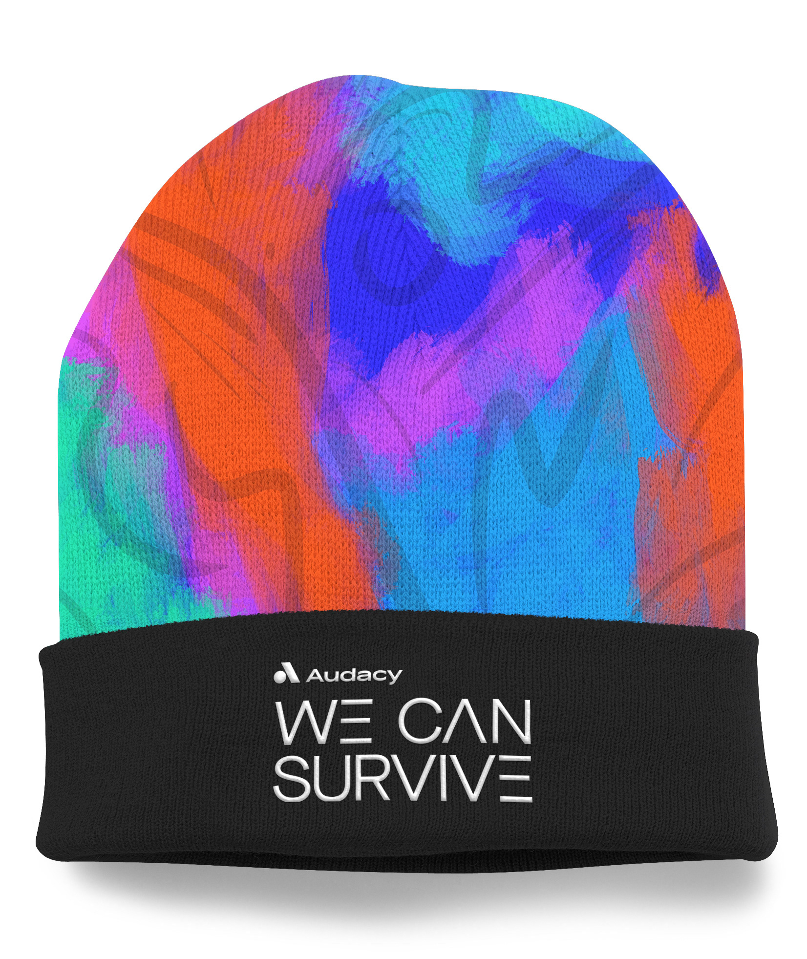
beanie
tote bag

stage
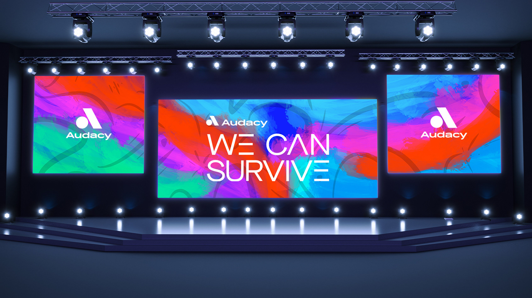
The background illustration done for the billboard graphics was split up into thirds to create a triptych for the screens on stage during the event to create a greater sense of cohesion.
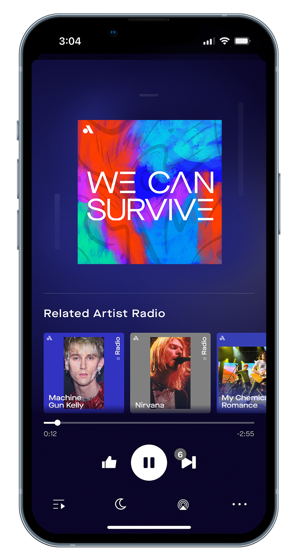
motion graphics
social media post
video bumper
Each of the paint strokes and pen lines are drawn on individually to create the background seen throughout this concept to create a sense of connectivity, movement, and energy. The We Can Survive Logo is also drawn on with a glow with noise that solidifies to allude to a plugging a guitar in to an amp in order to tie back into music.