
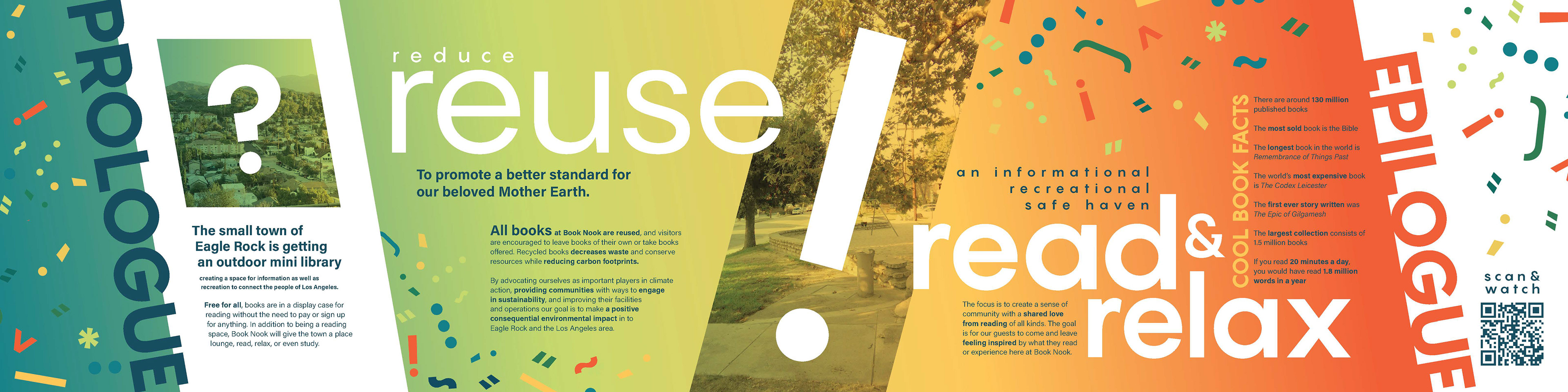
The goal of this project was to create a brand for a public space renovation focused on sustainability and giving back to the community.
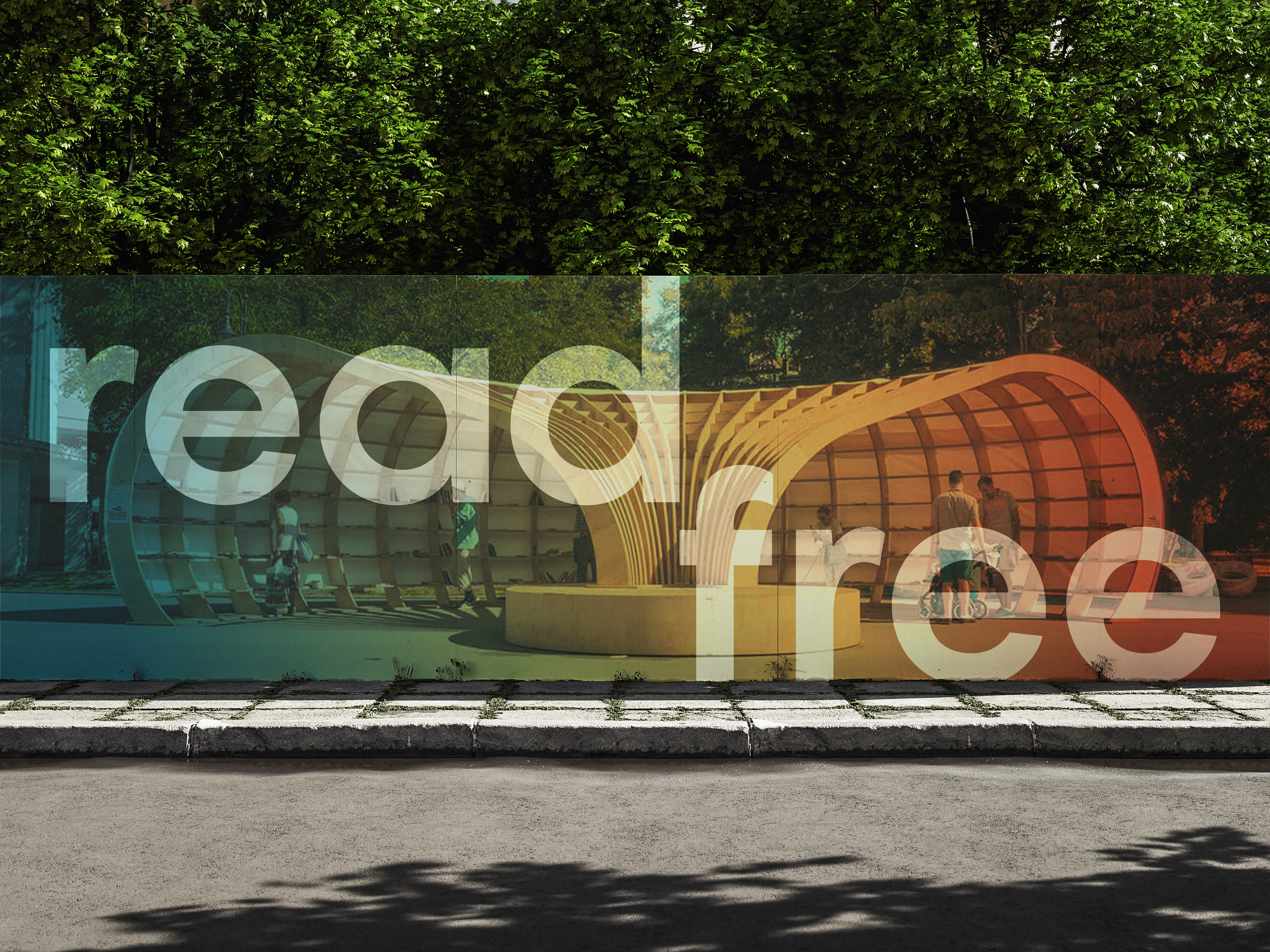
Inspired by street libraries, Book Nook is an outdoor mini library creating a space for information as well as recreation for people to connect the people of Los Angeles. The driving design theme of this project was youthful energy combined with information stemming from books and recreation provided by the outdoor nature of parks.
Brand Identity
logo & typography
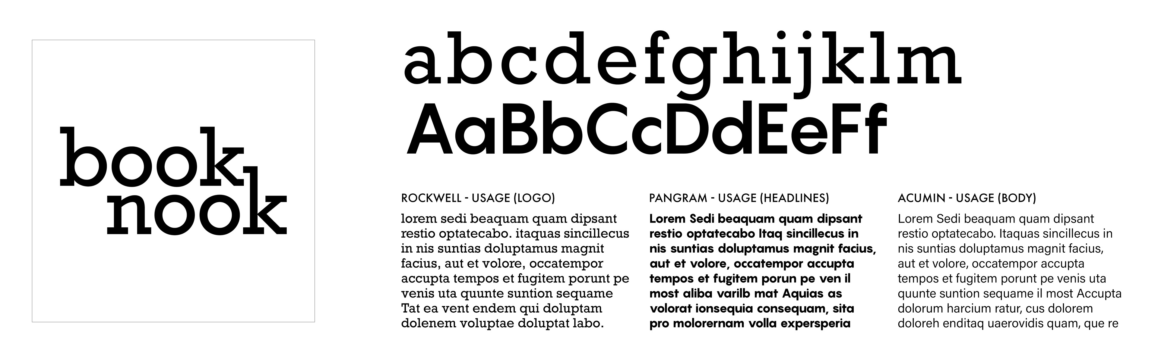
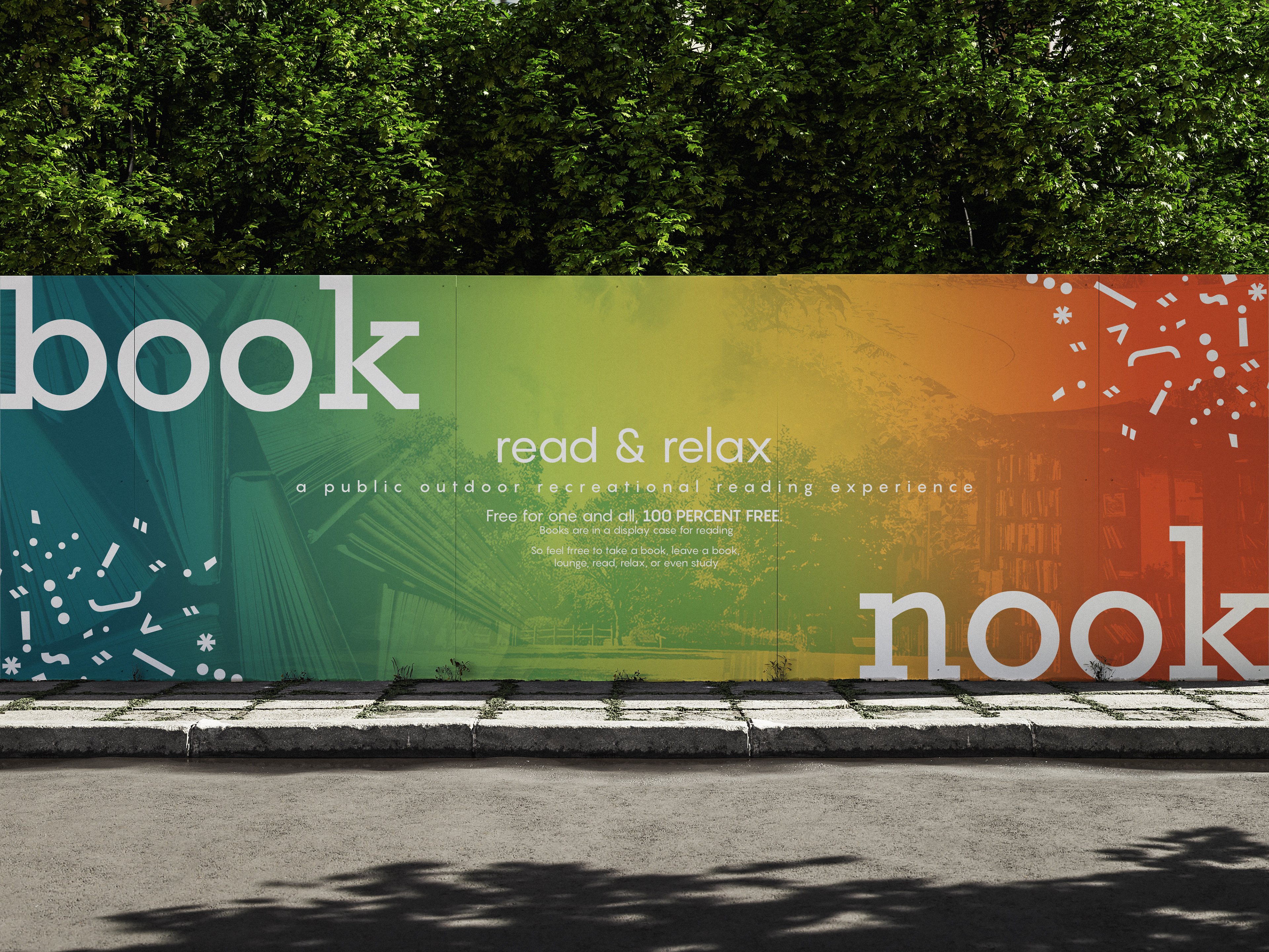
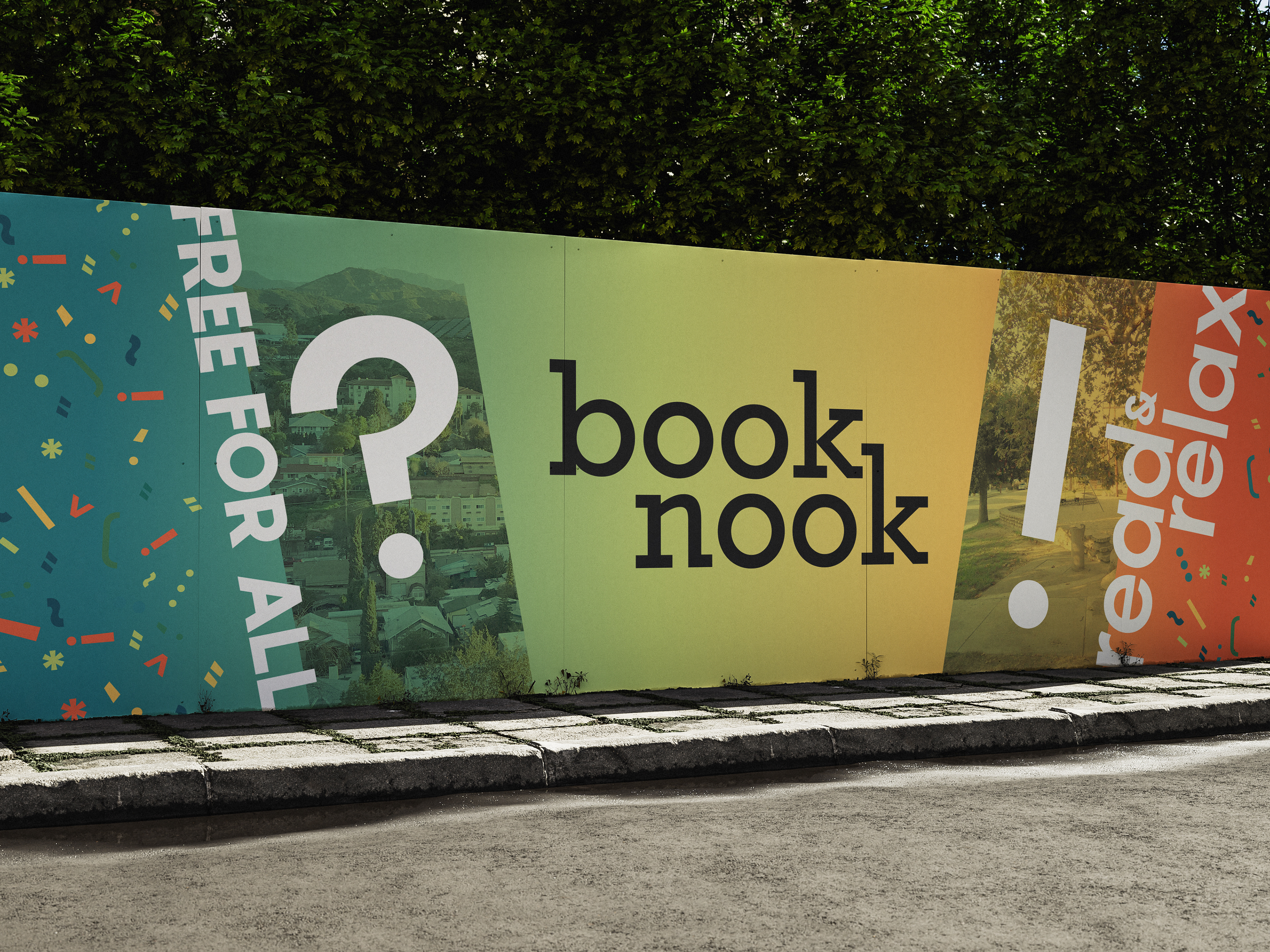
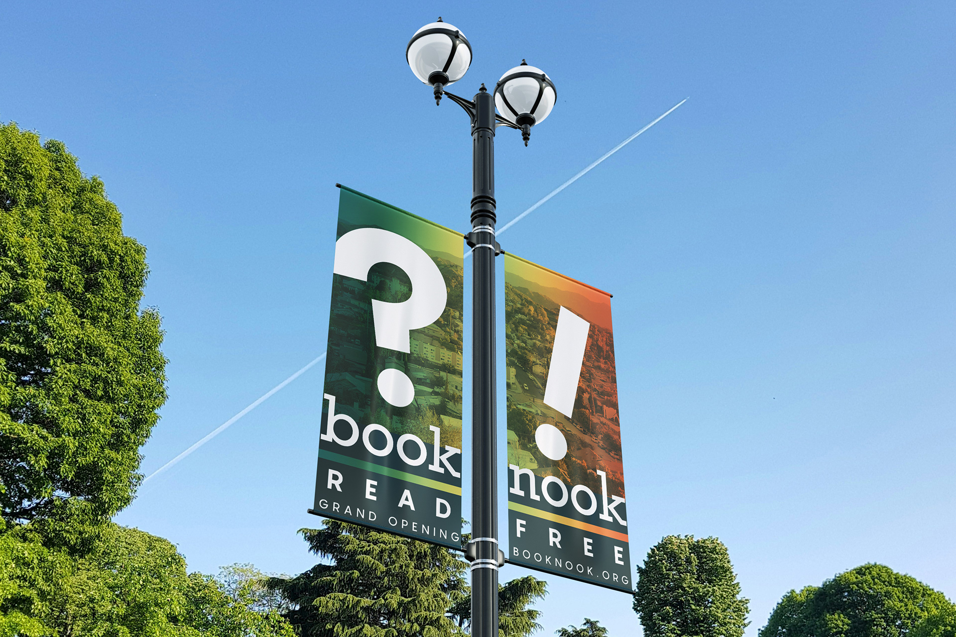
Due to the concept being centered around books, it was important to implement that into the look and feel of the logo. The typeface chosen for the logo is Rockwell, as the typeface gives a sleek contemporary feel and the chunky slab serifs mimic the look of books laid on their side.
The words Book and Nook are "nooked" together with the two k's playing off of the definition of the word nook and accentuating the small yet cute nature of a mini library. The ascenders are also customized to be slightly extended in order to give the exact amount of satisfying negative space where the two k's meet.
color palette
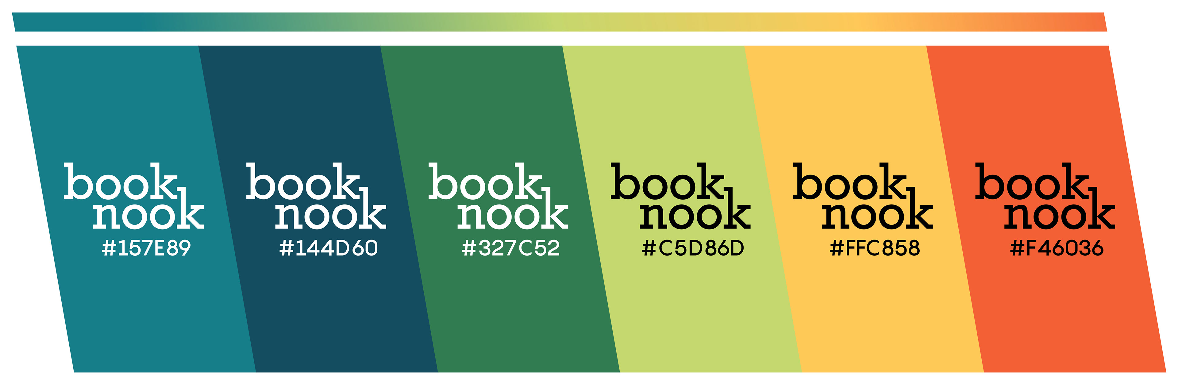
The colors chosen are bright and bold to capture that youthful energy. The primary colors being those blues in order to have a scholarly tone with the greens, yellow, and oranges serving as secondary colors representing elements of the outdoors such as grass, nature, and the warmth of the sun.
icons

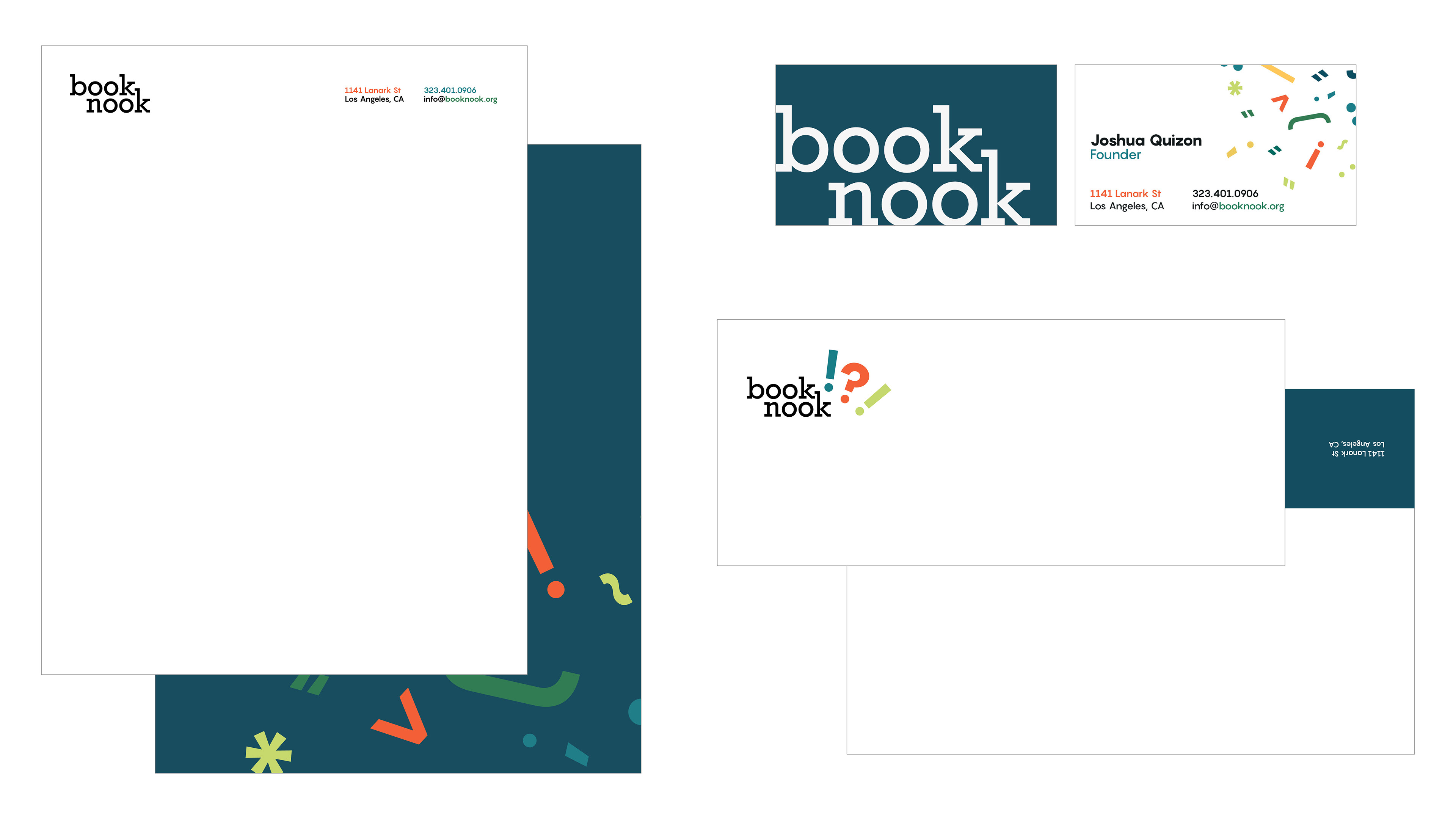
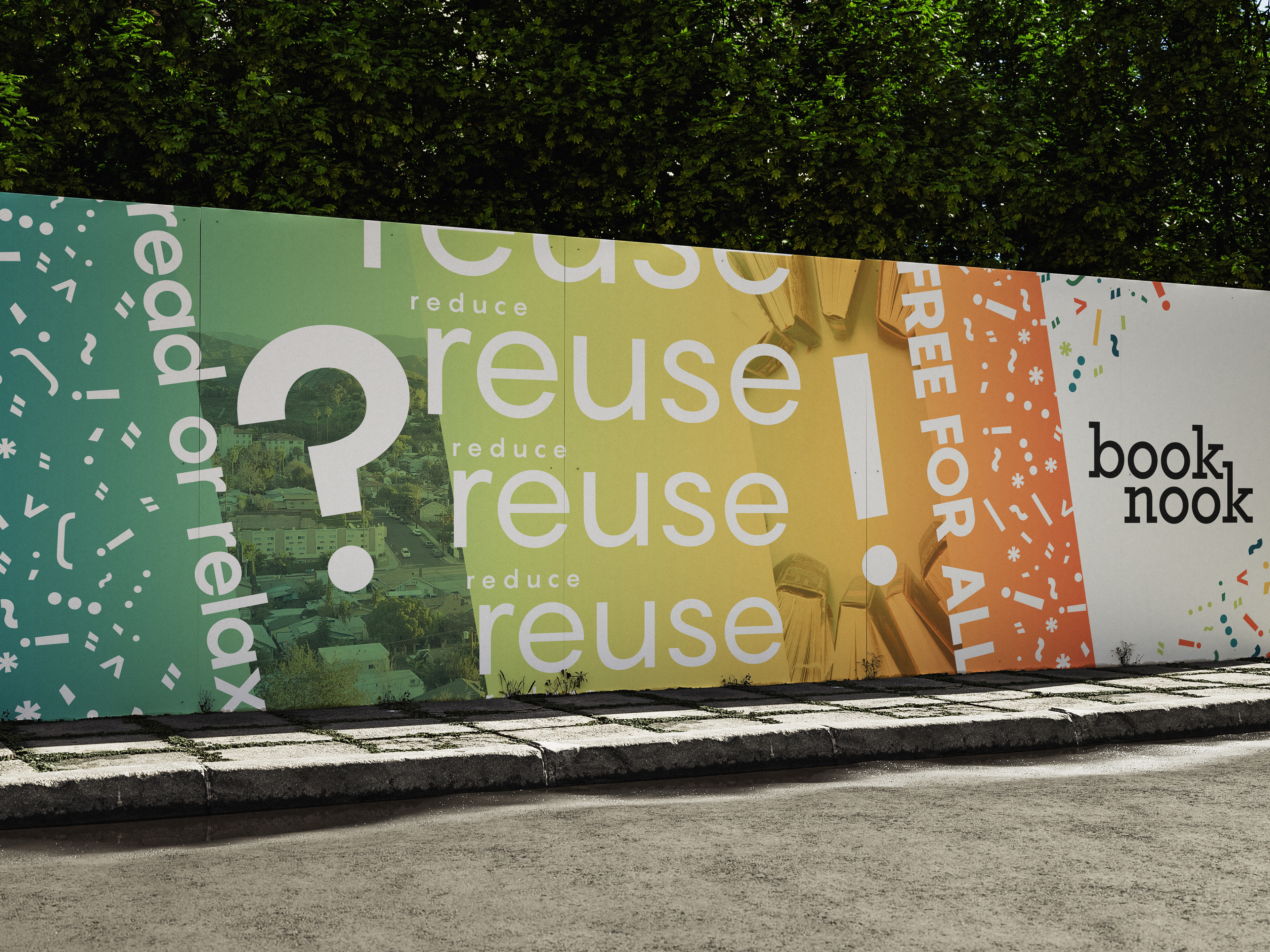
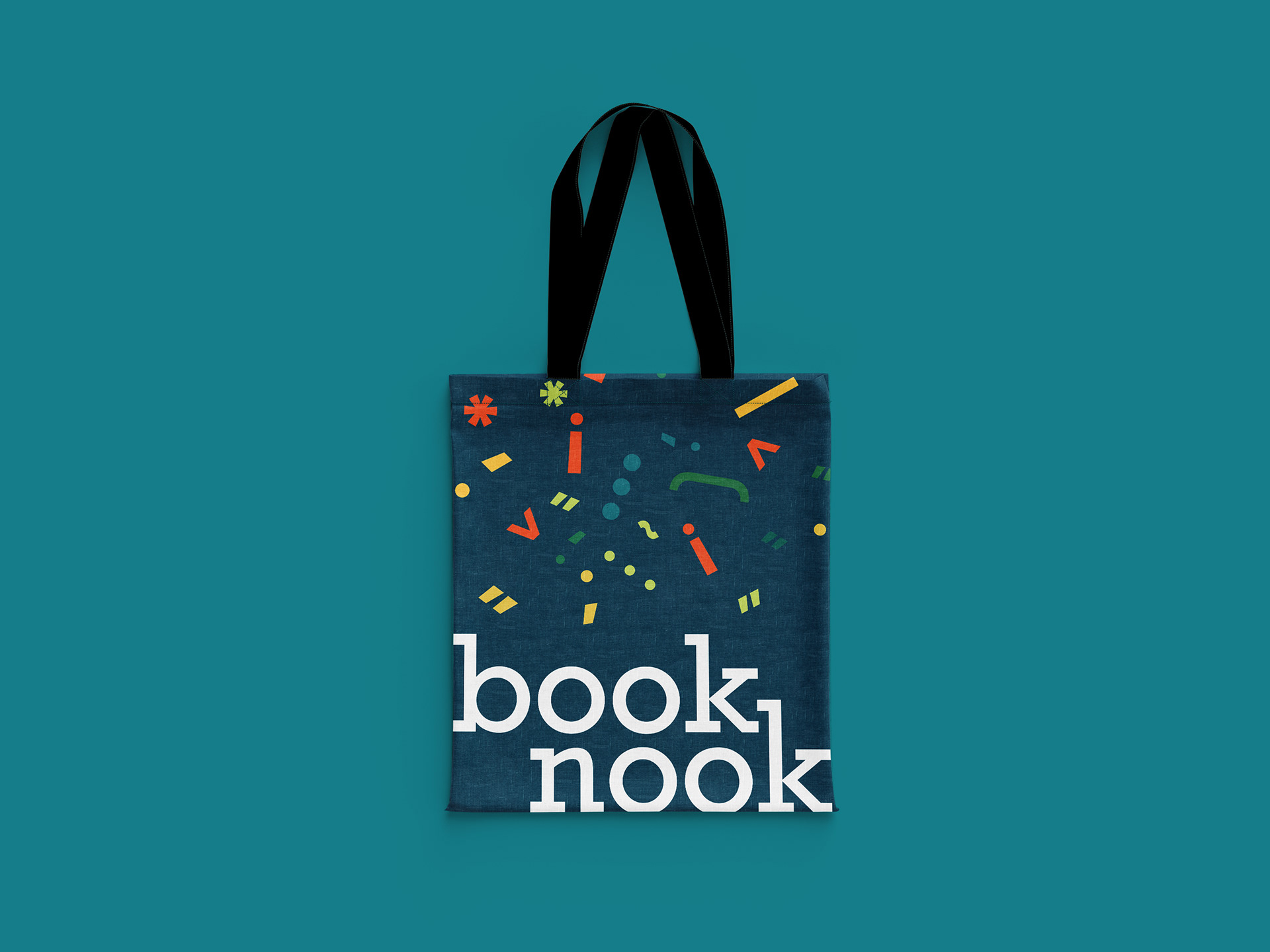
The icons used throughout are various punctuation marks in different colors to tie in to the literary symbols already used that audiences can recognize, but use them in a new visual language such as confetti to make them seem more fun.
stationery
wall graphics
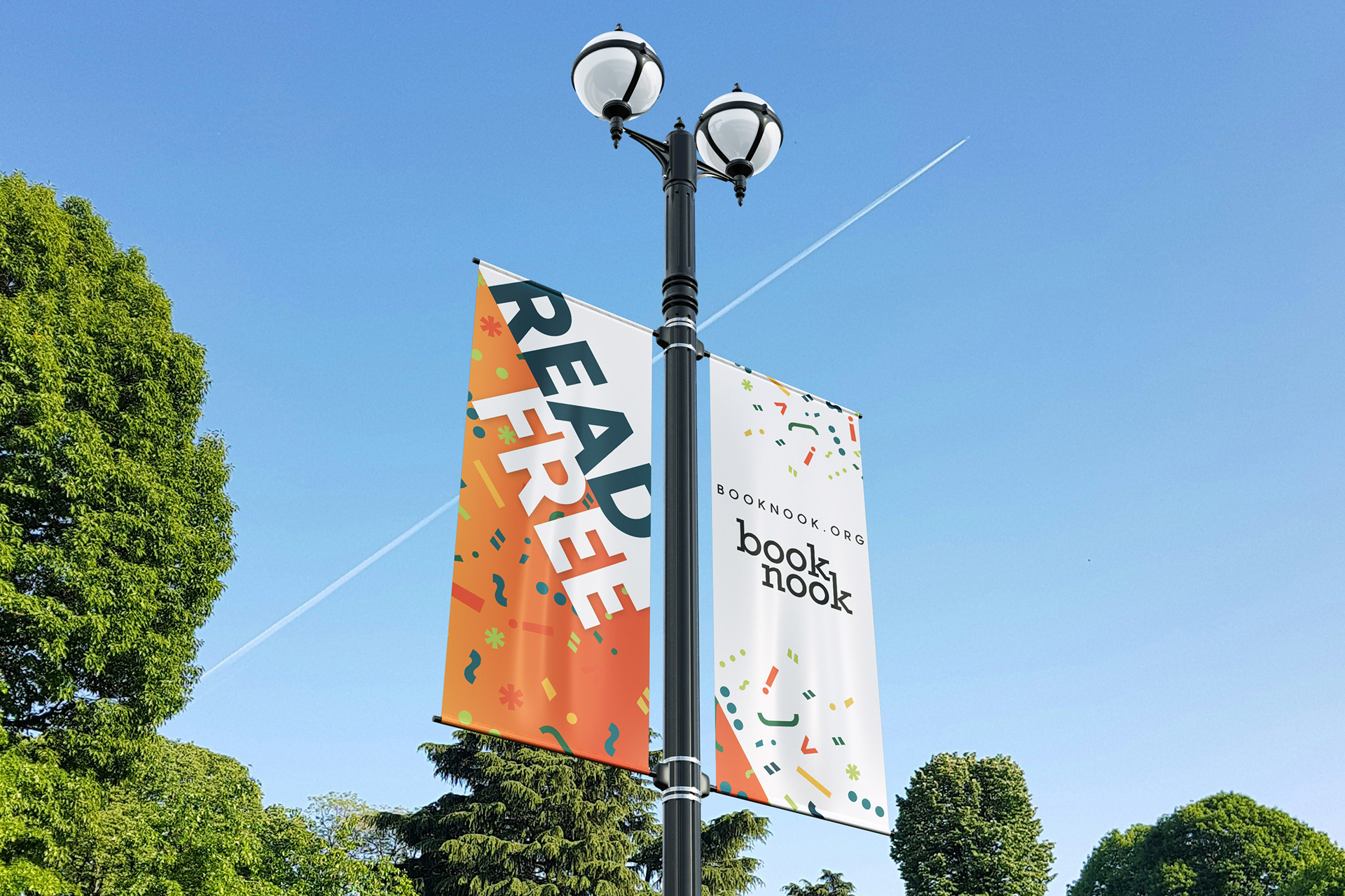
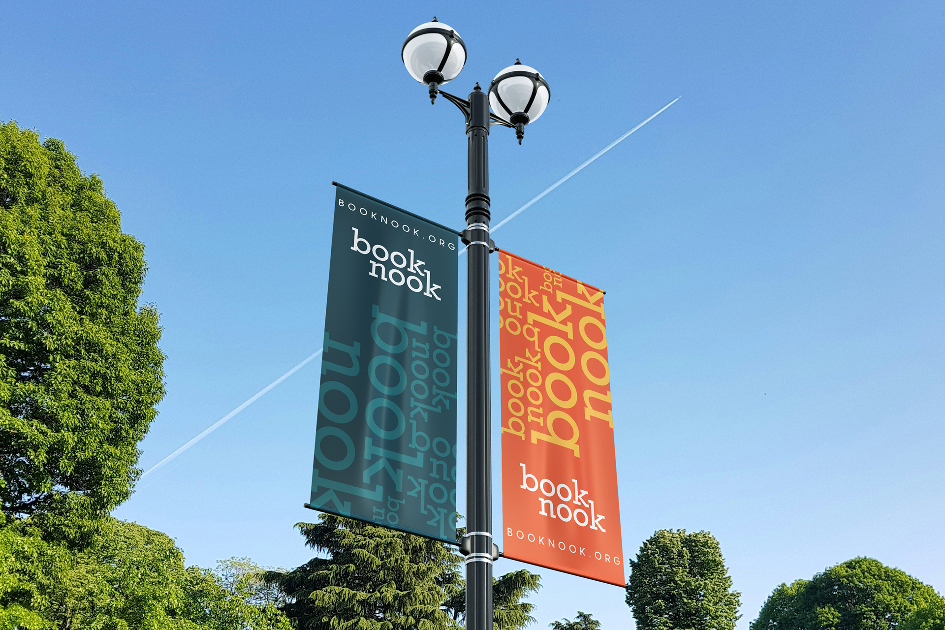
street banners
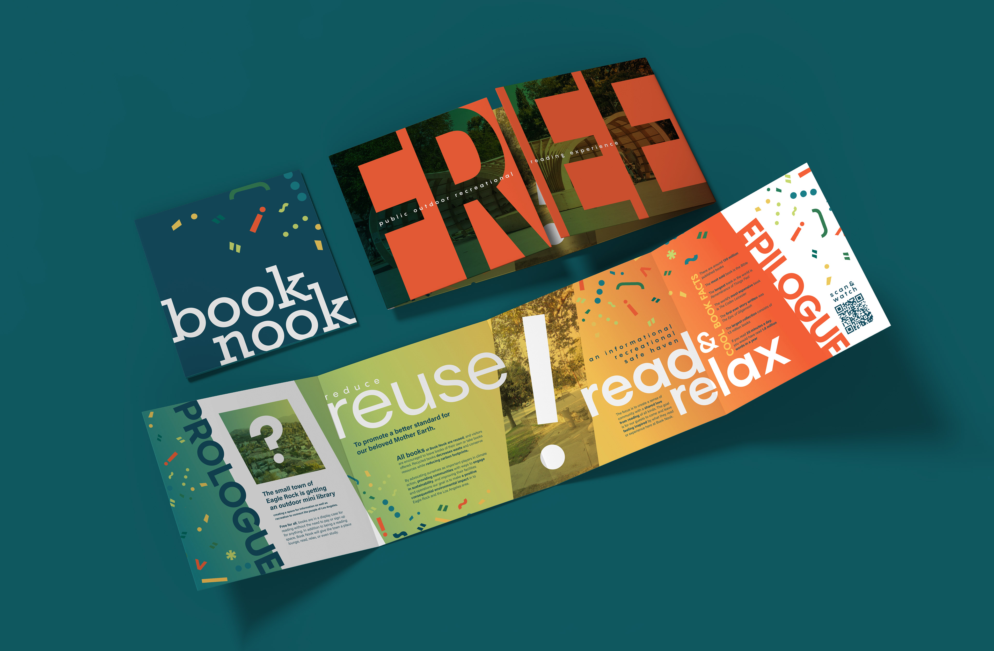
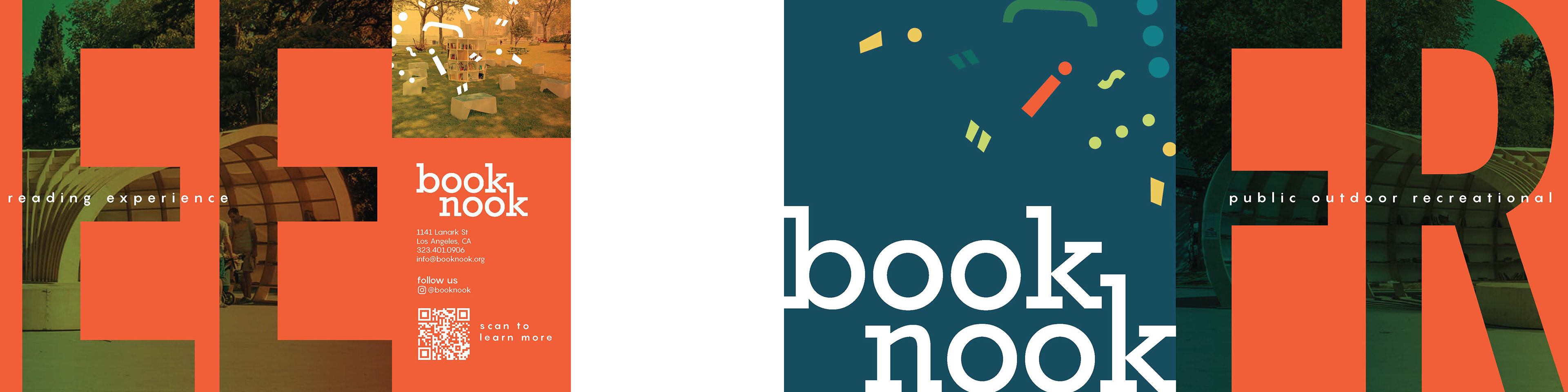
brochure
mock up
flats
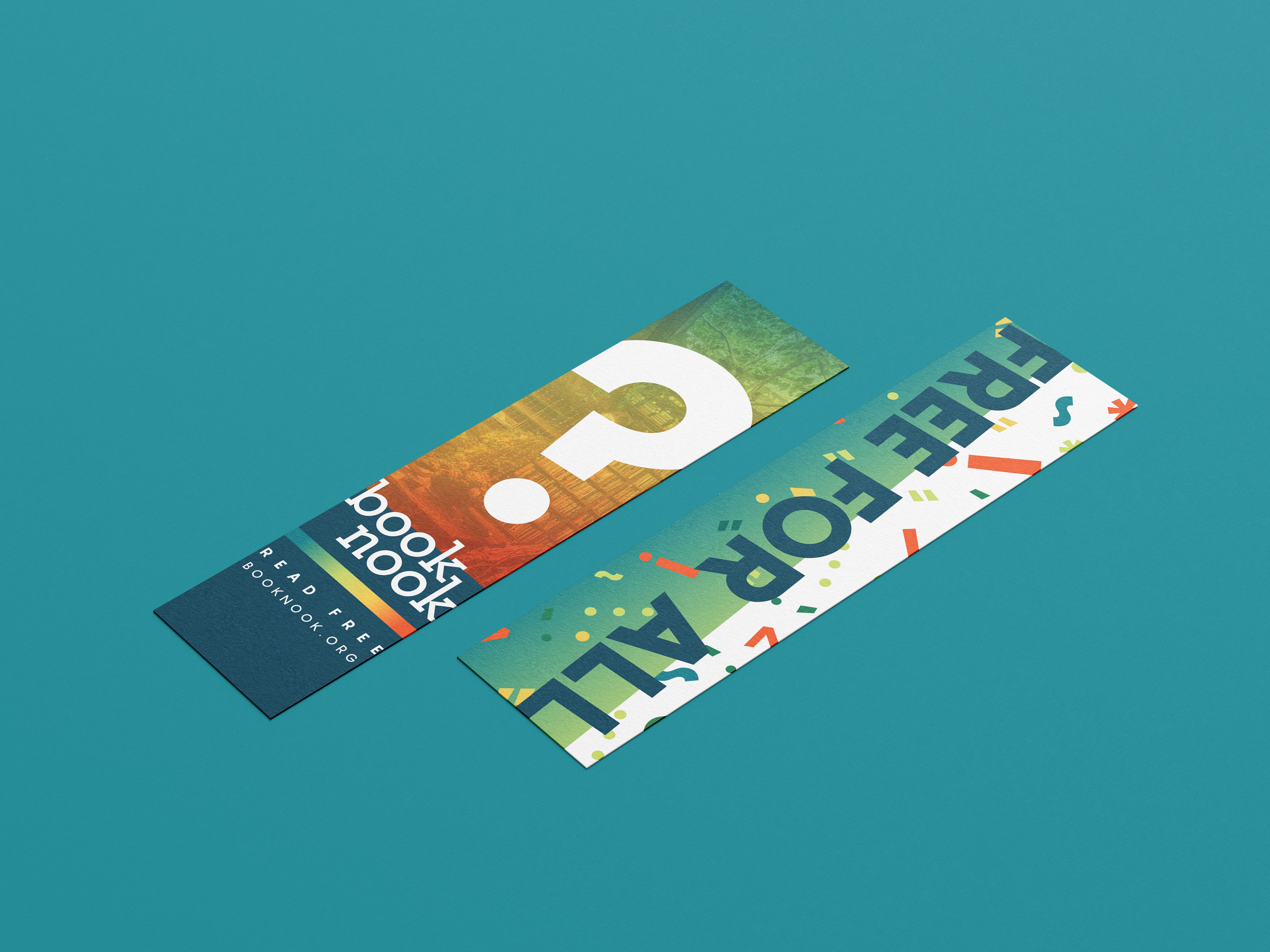
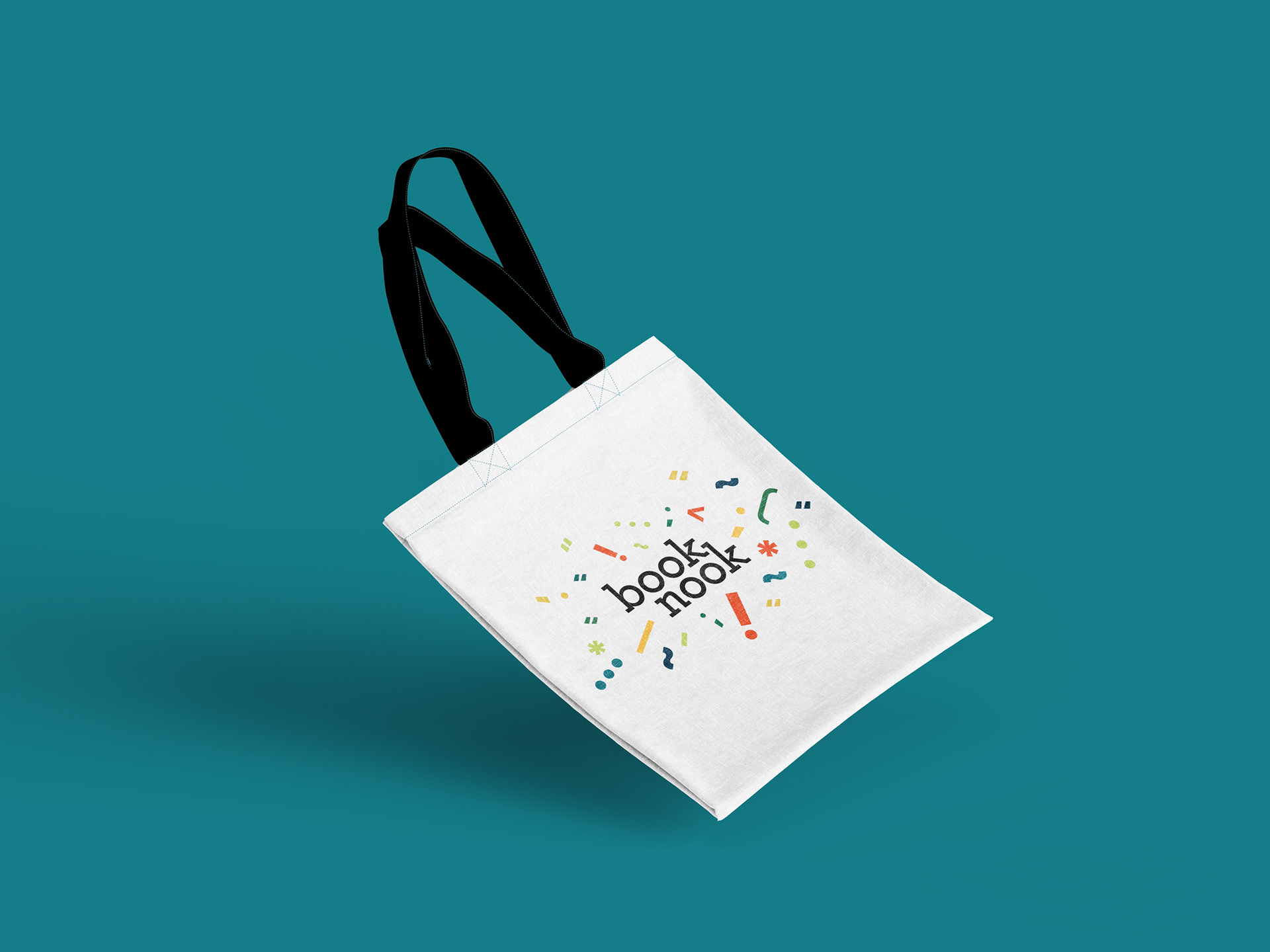
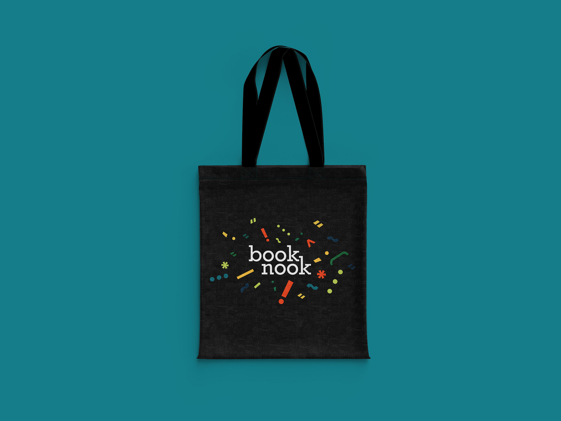
Merch
bookmark
tote bags

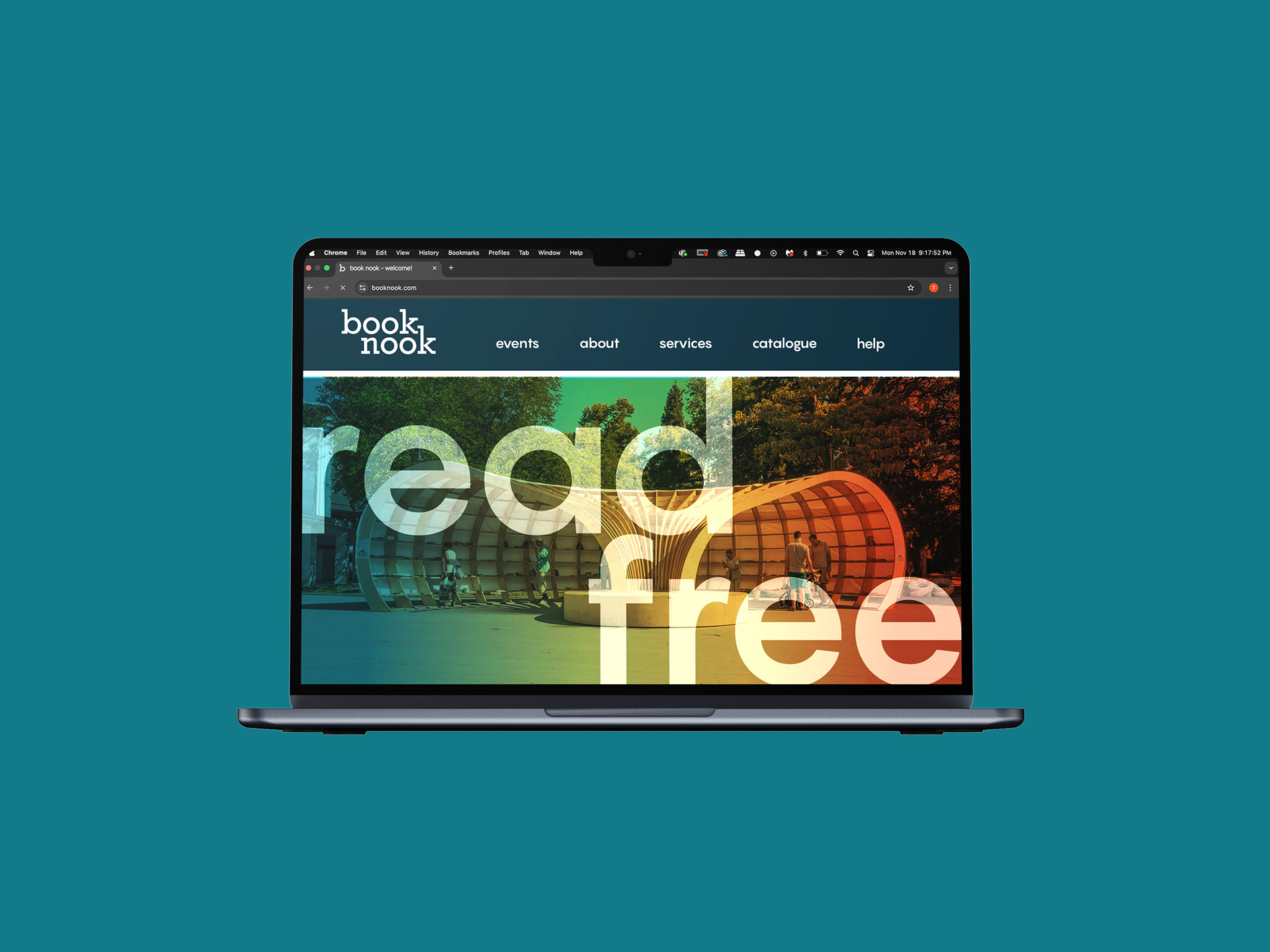
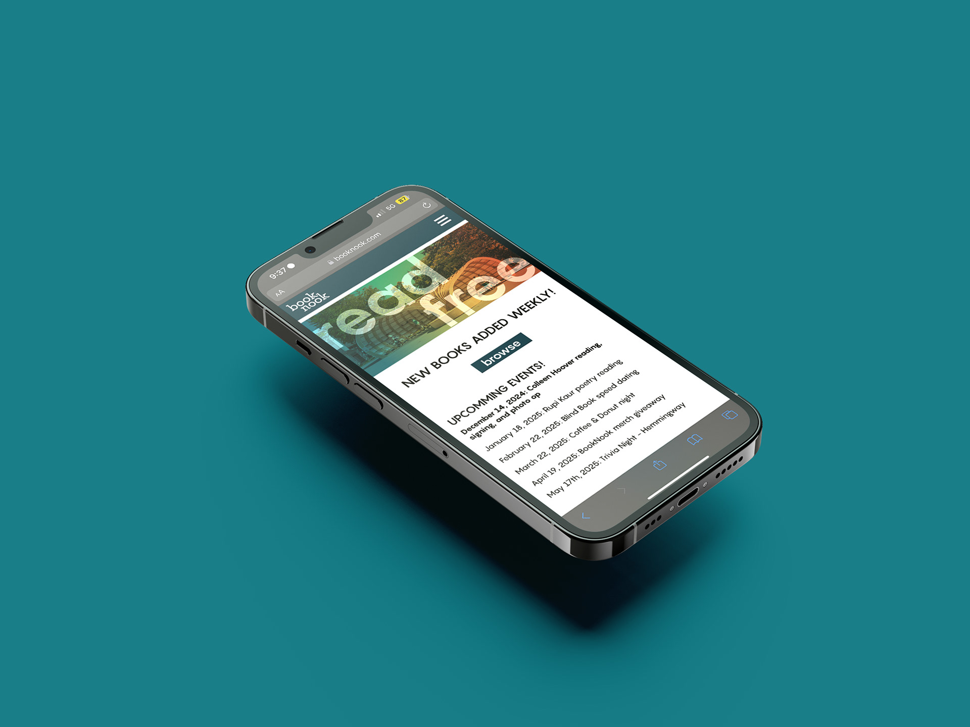
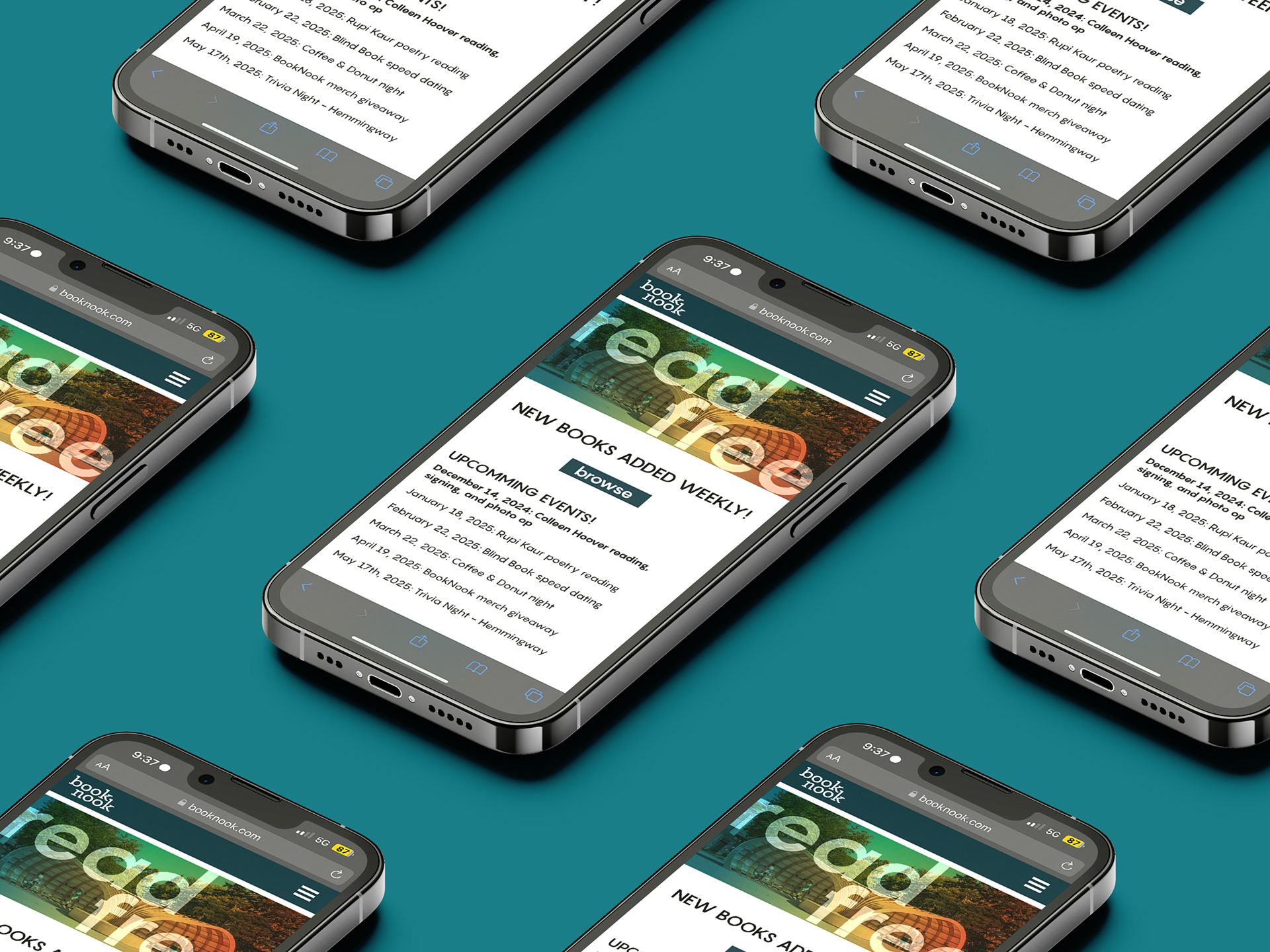
Website
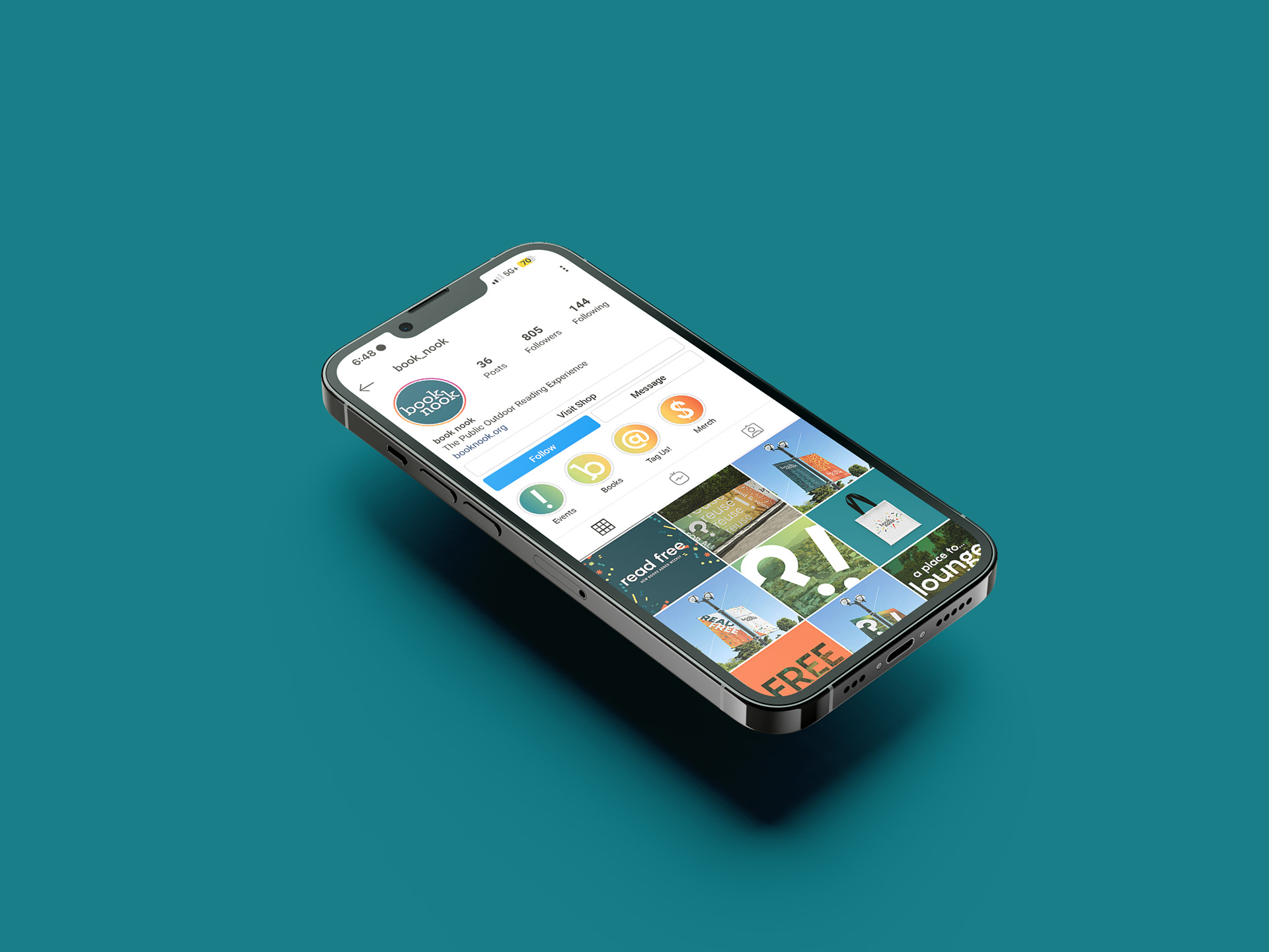
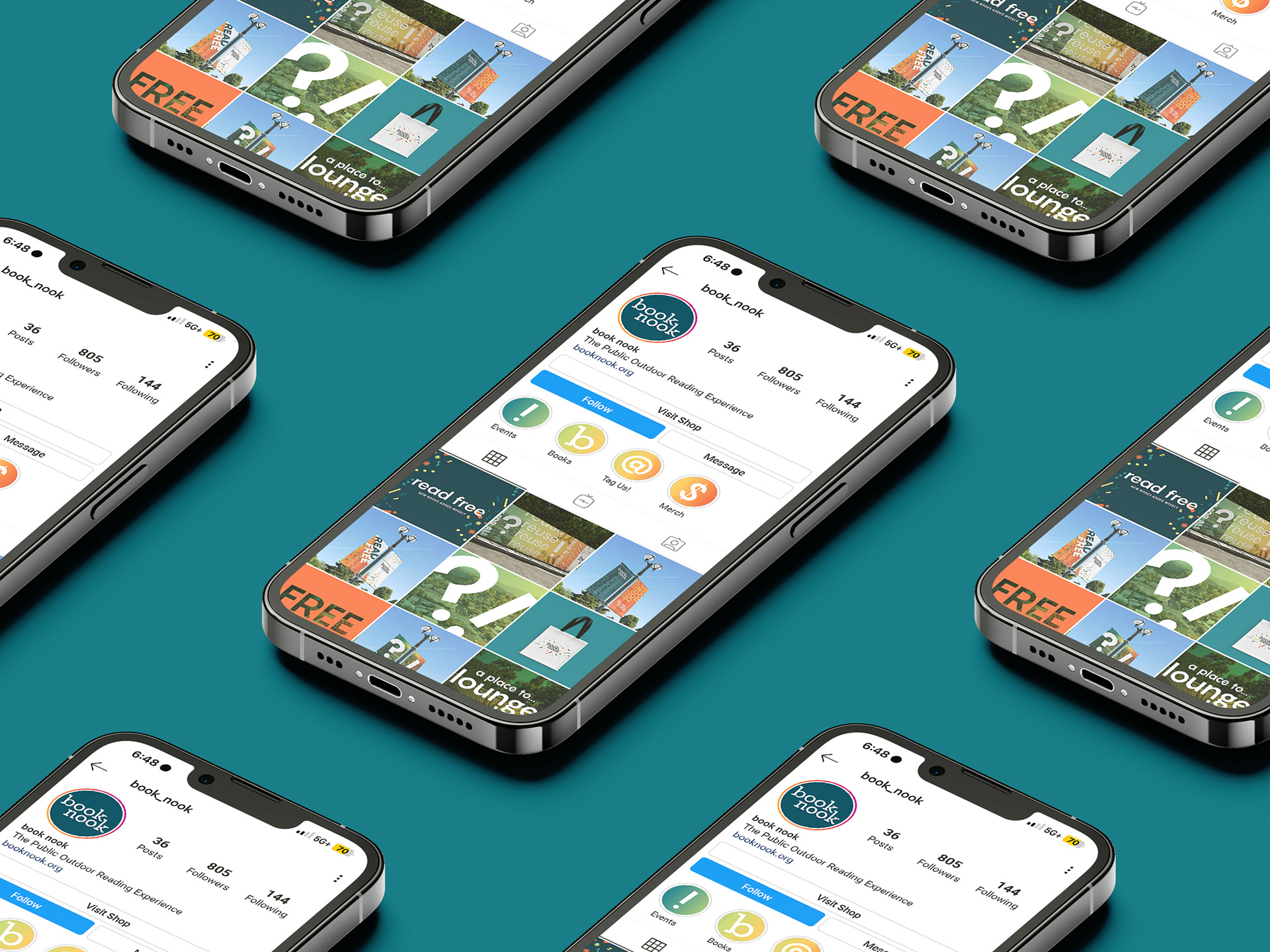
instagram page

motion graphics
30 second ad
instagram square
instagram reel