
The goal of this project was to create a concept for a hypothetical line of limited edition product line featuring four items packaged in a specialized structure.
Inspired by Spotify Wrapped, the annual recap of a user’s listening history throughout the year, the concept of Spotify Encore is a set of personalized physical versions of their hypothetical Spotify Wrapped.
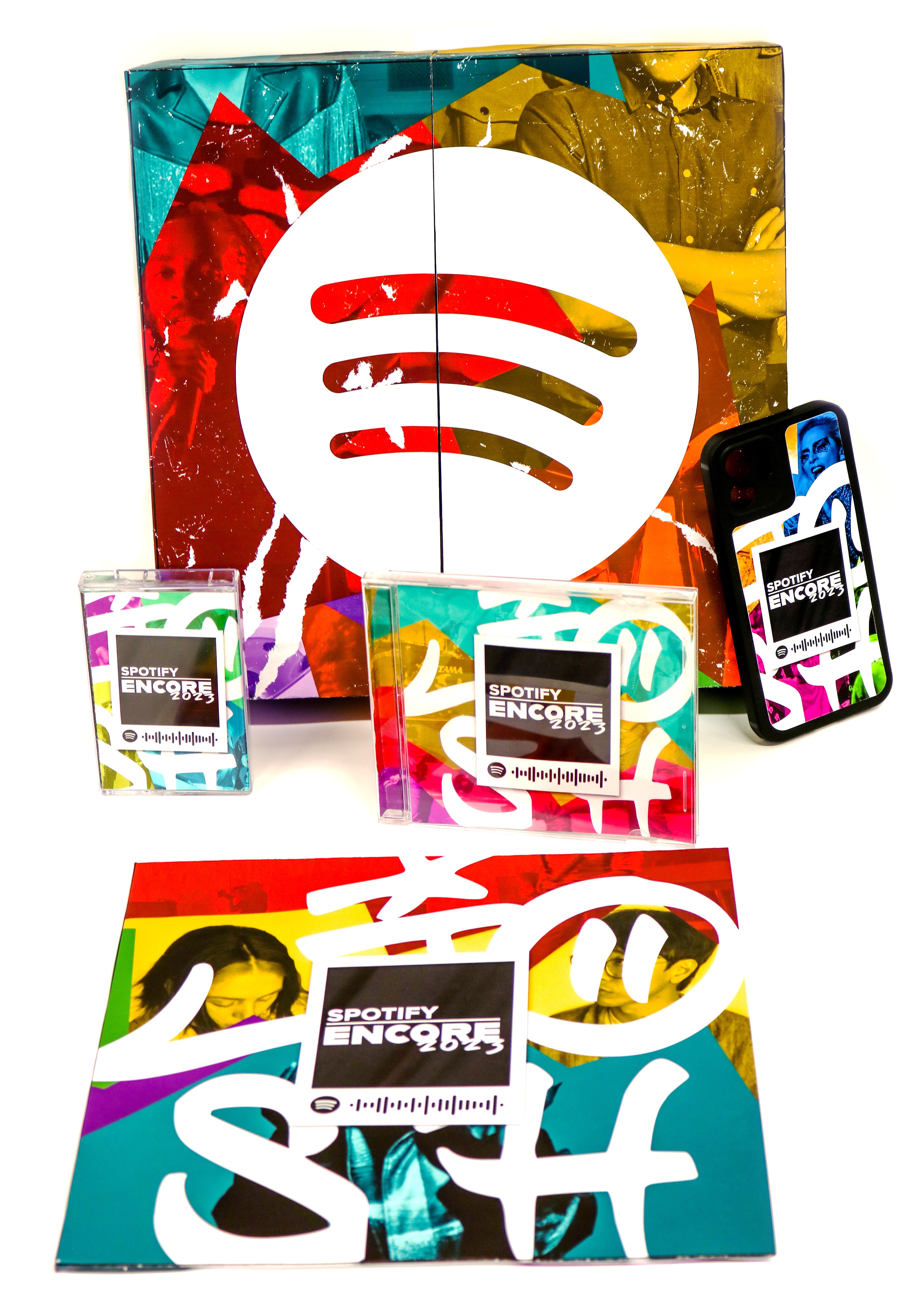
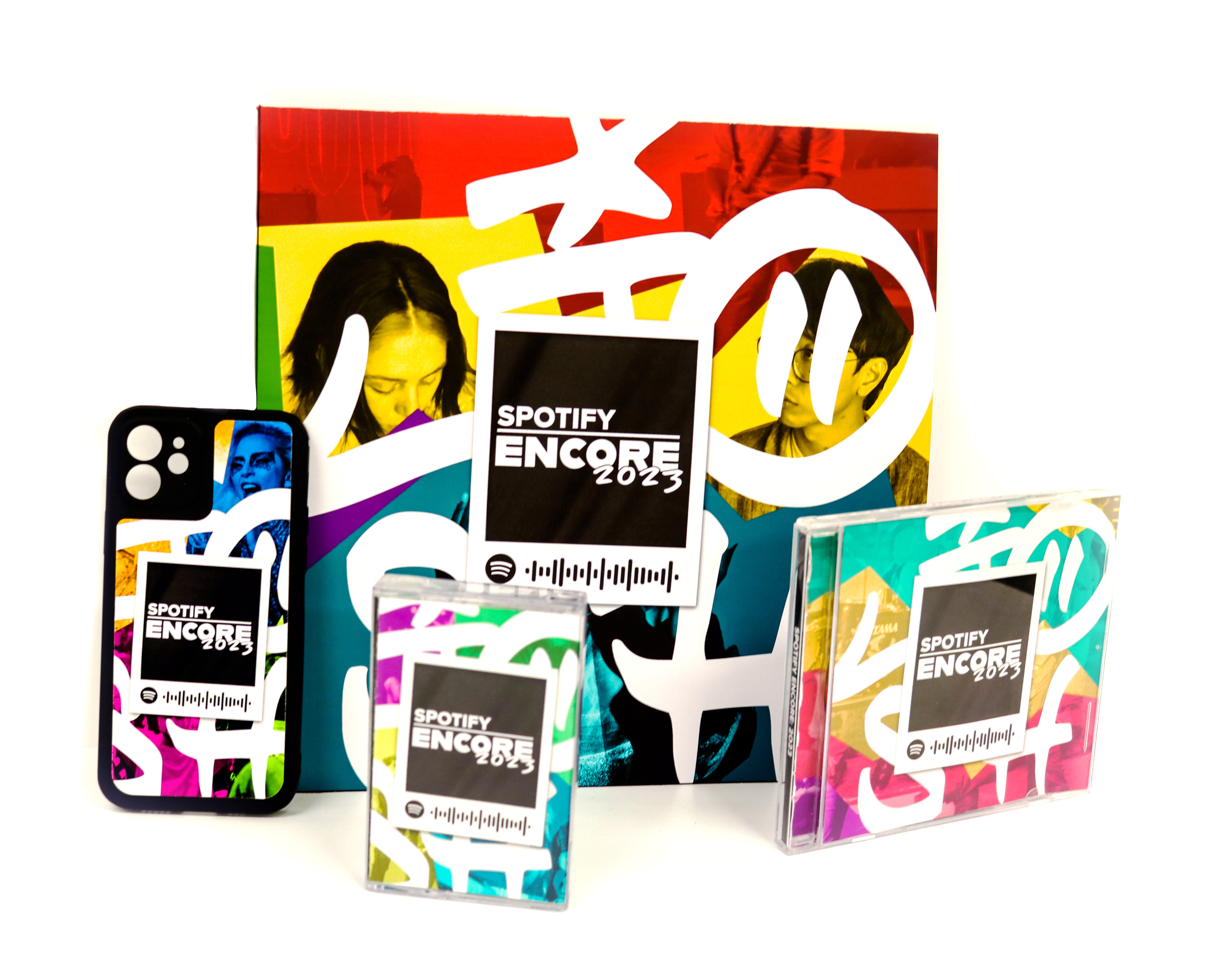
The line is based on the revival of physical media towards music enthusiasts and includes: a vinyl record, cassette tape, CD, and a phone case. Each of the products are based on a particular method of listening to music relative to a specific decade they were popular.
The driving design theme was based on memories, as the concept of Spotify Wrapped is a look-back of a given year. Thus, scrapbook aesthetics such as polaroids and collage, ephemera kept after music events like stickers or receipts, and handwritten type were the visual language chosen to represent a snapshots of moments throughout the year.
Outer sleeve
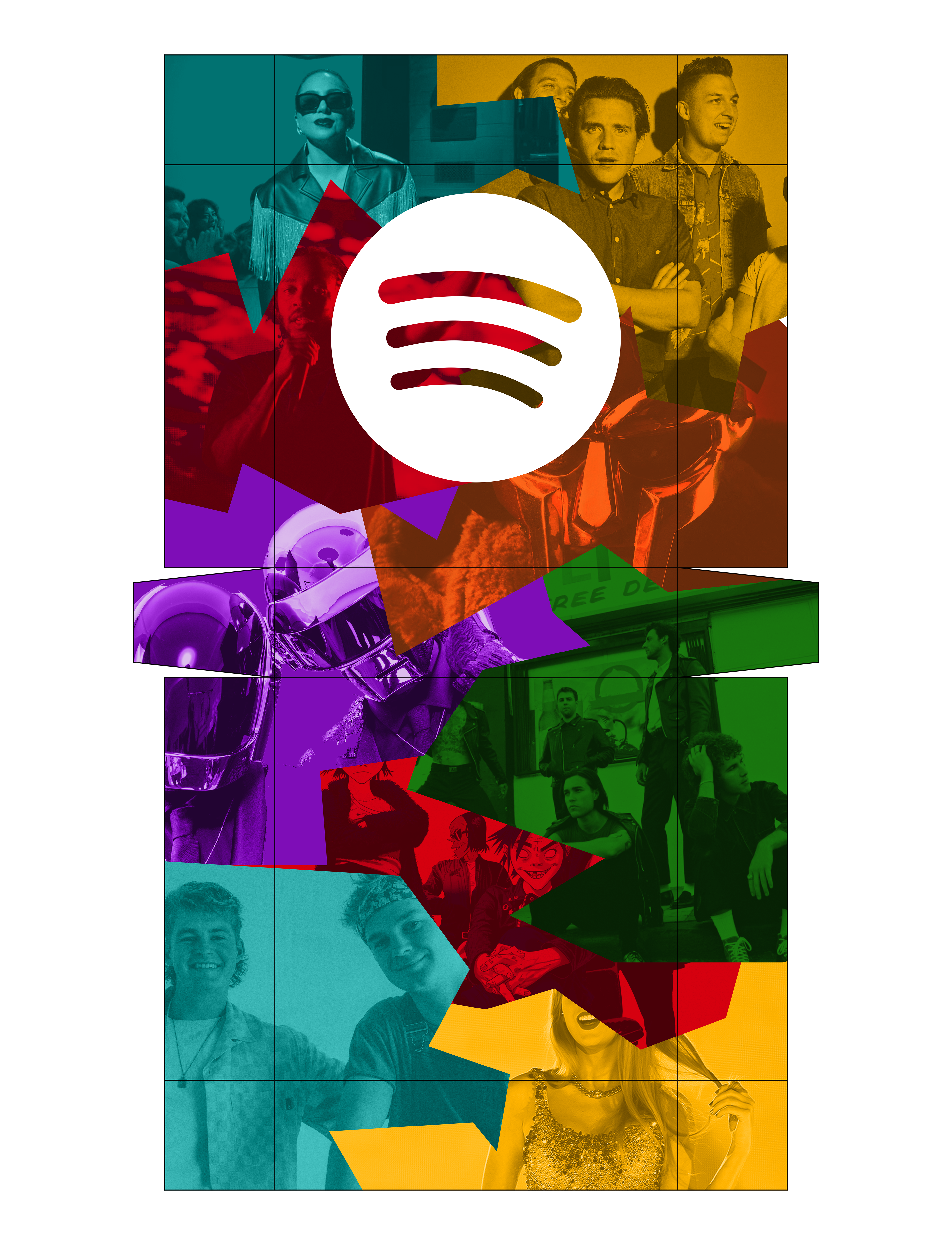
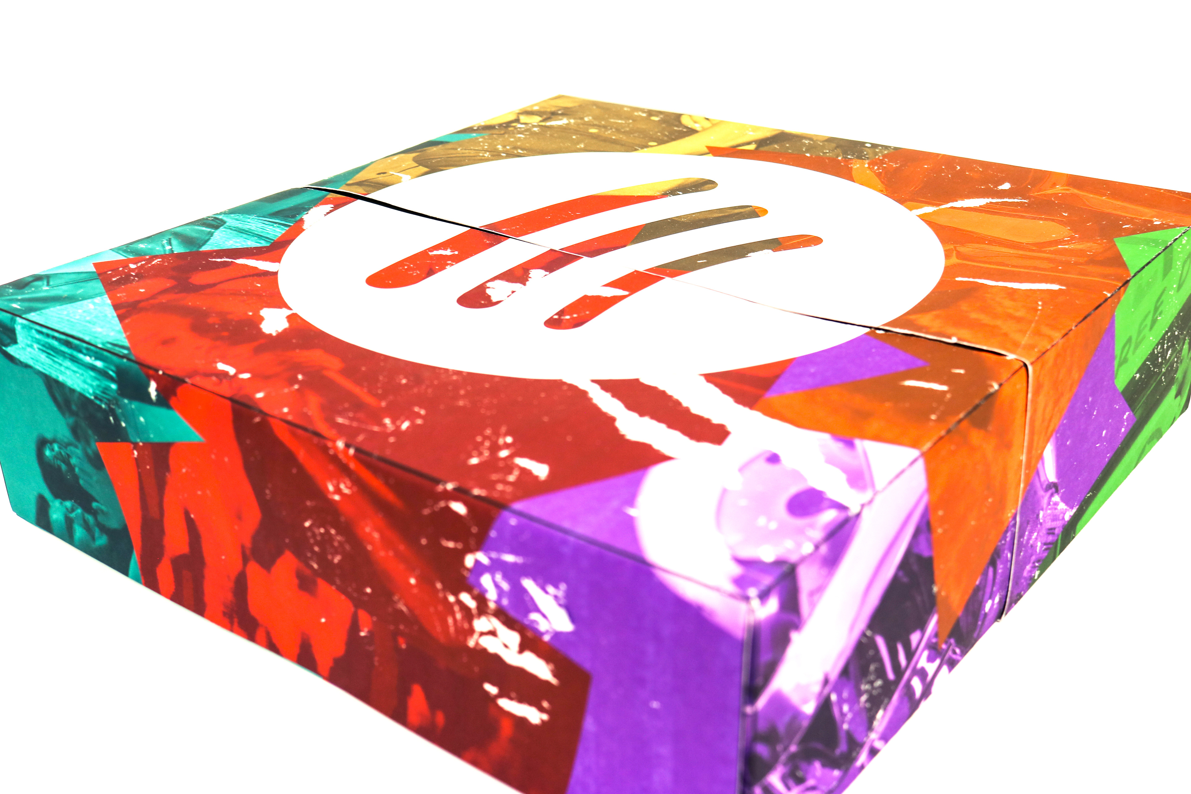
The kit is contained in an outer sleeve which split open in half. The background is a collage of the hypothetical user's top artists of the year with the different wide variety of colors symbolizing the blending and combination of a variety of music styles. The Spotify logo was a shiny satin decal put on to give the kit a more elevated feel, and weathering was done on the outer sleeve to give the sleeve a nice texture to feel as well as look at.
Inner Box

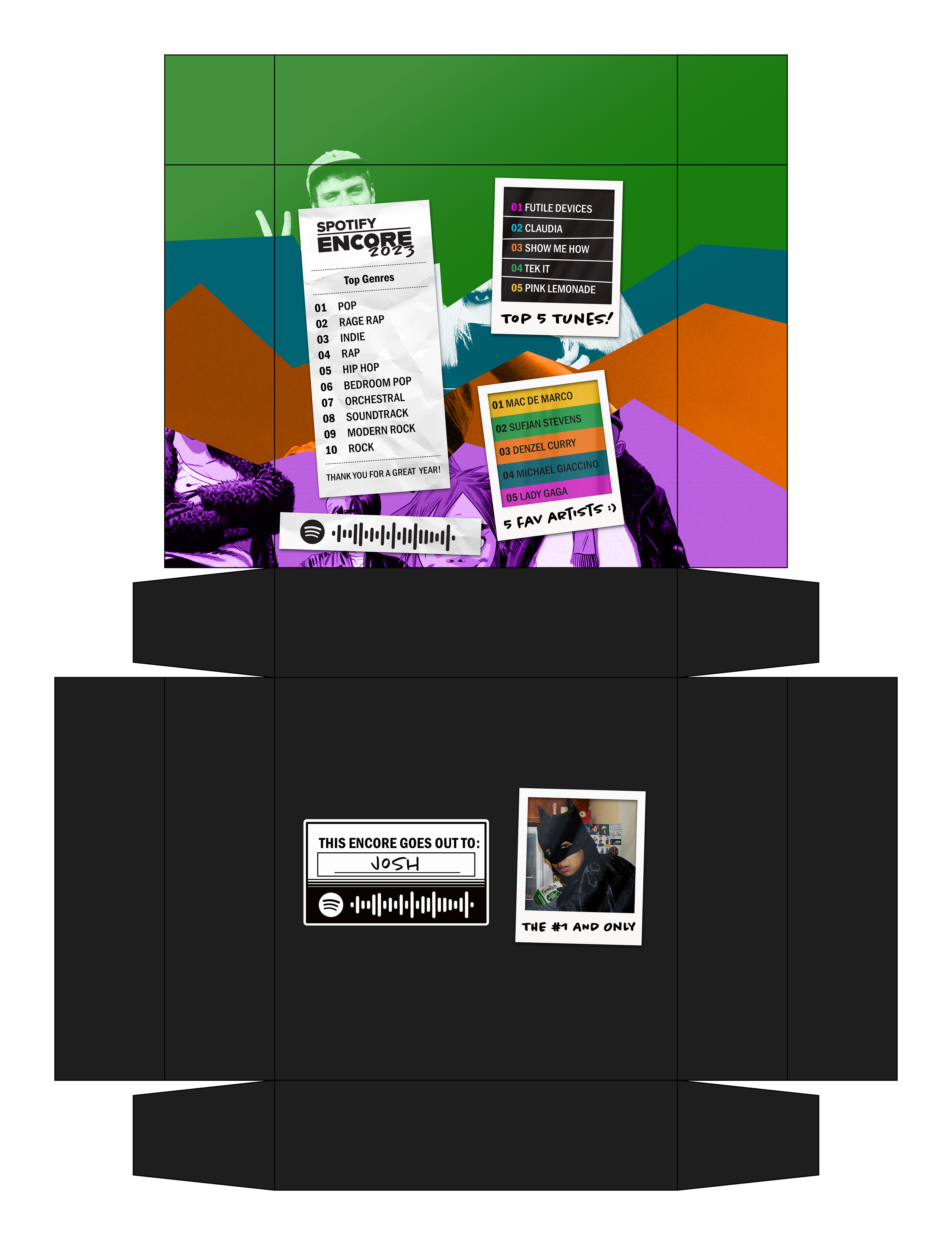
Upon opening the box, the user is treated to their data from their Spotify wrapped displayed on the top half, their items placed in a foam insert in the bottom half. The username, profile picture, and Spotify profile code is also displayed underneath the items to add to the more personal feel.
vinyl record Cover
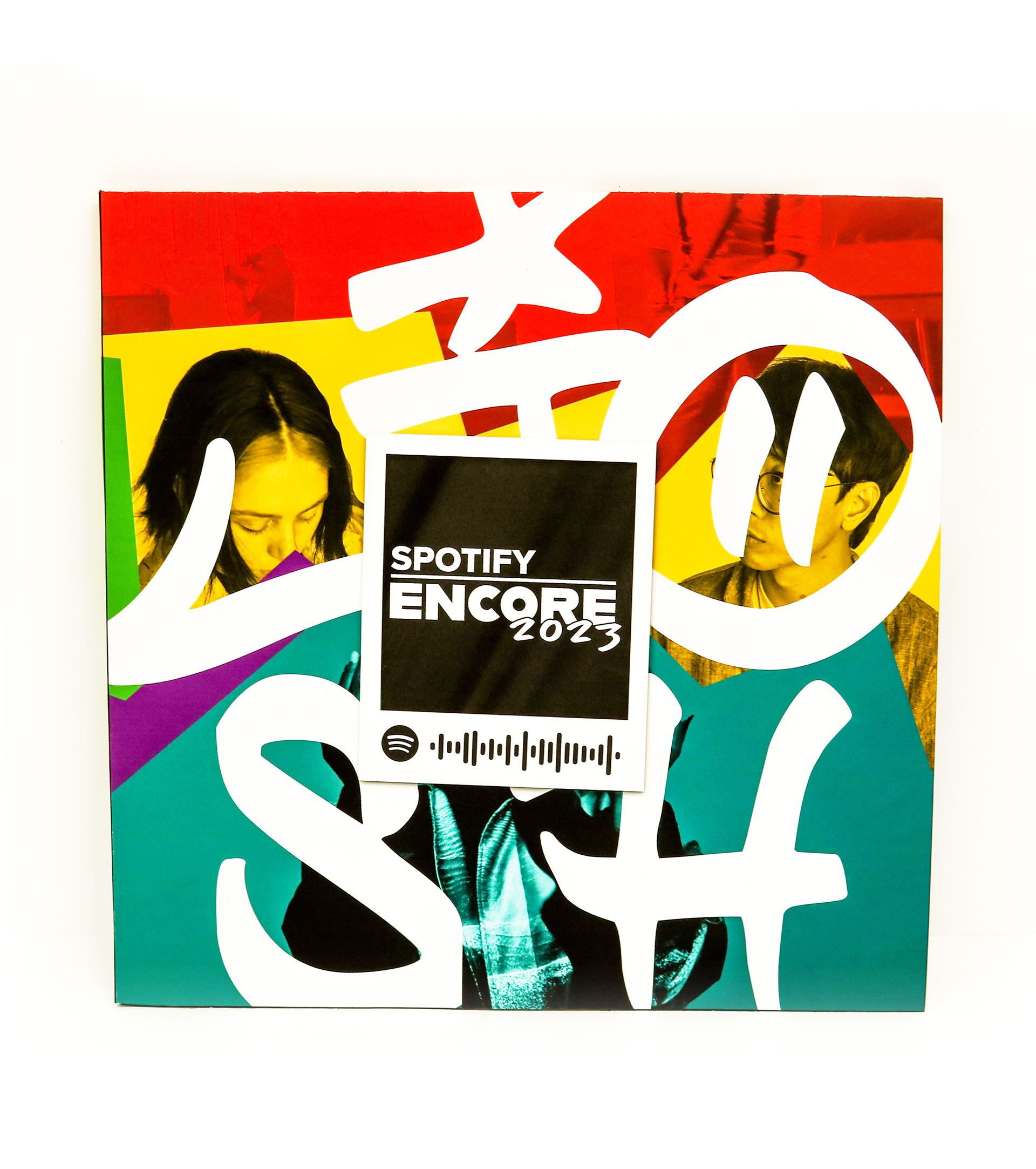
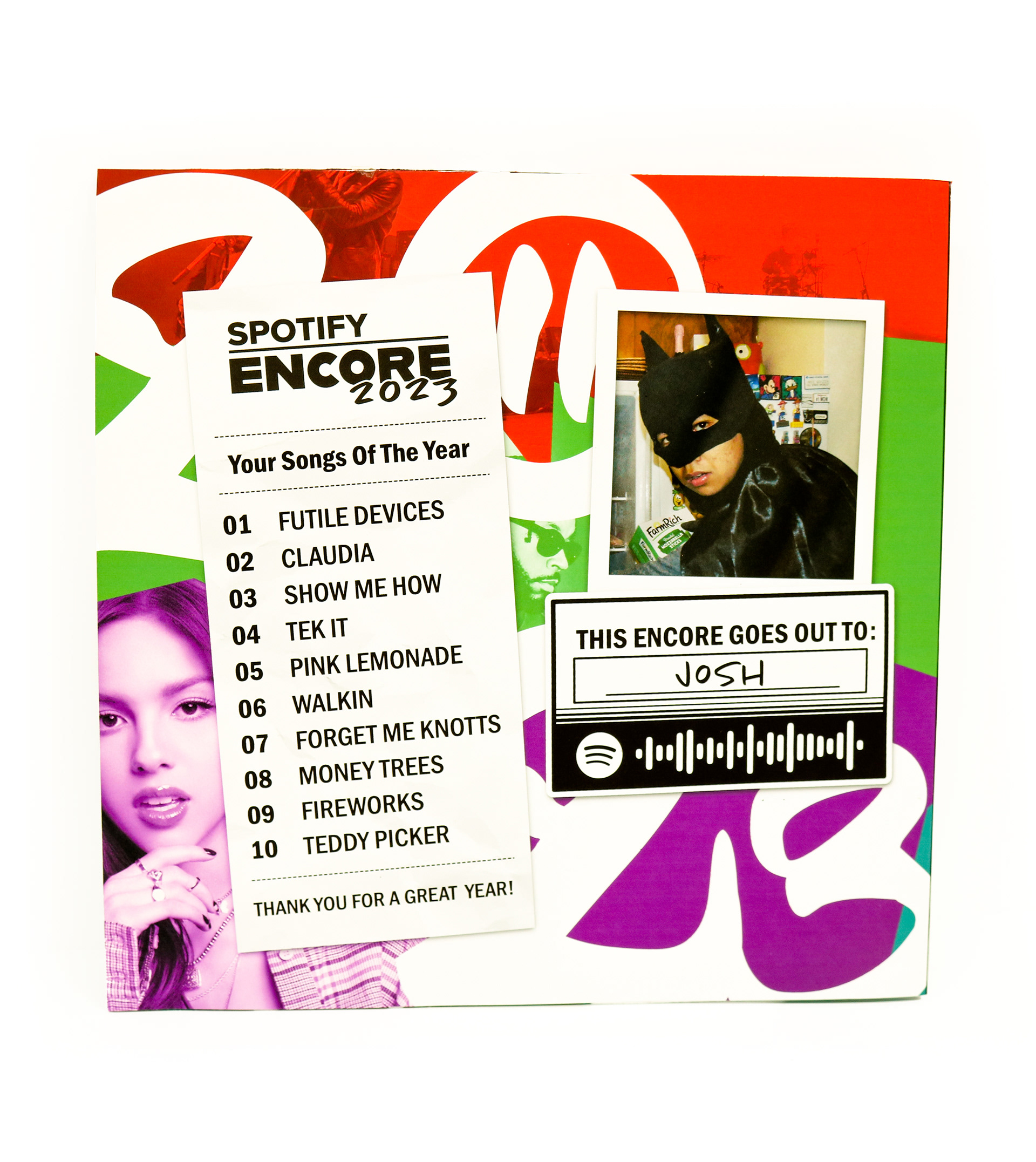
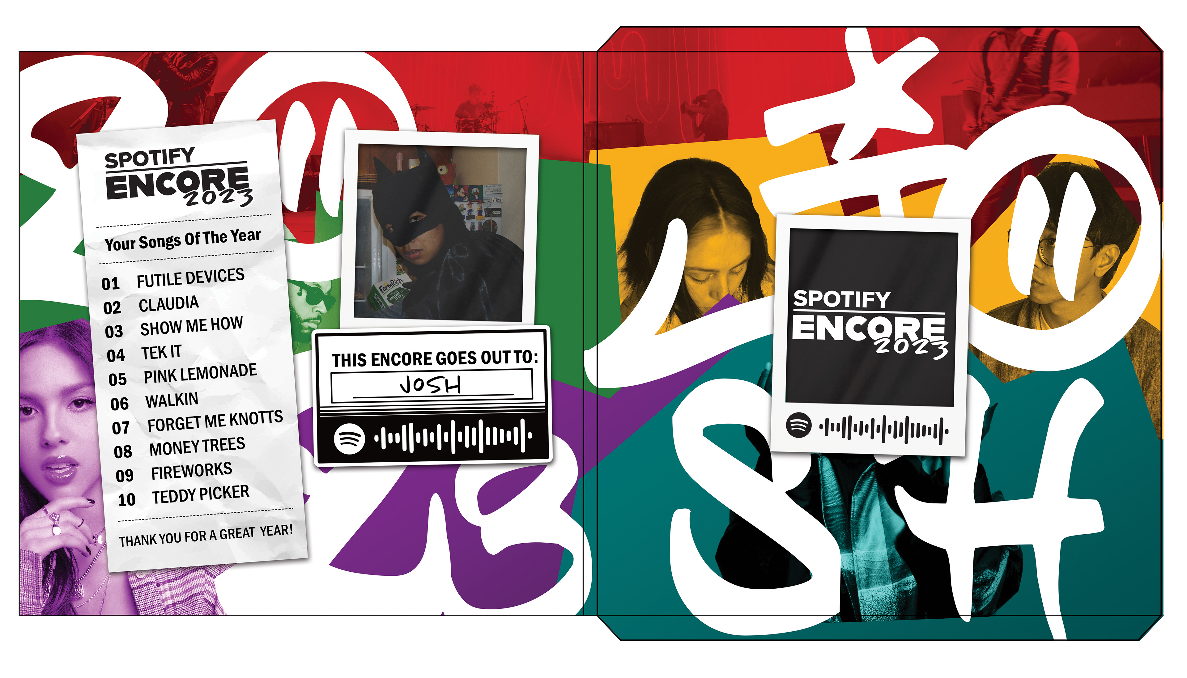
The vinyl record cover was based on a 70's color palette with a slightly muted rainbow.
The front has the users name blown up in a handwritten type with a code to the digital version of the track list. The back has the username, profile picture, Spotify profile code, the track list based on their hypothetical most listened to songs of the year, along with the year they are recapping in a similar style to the user's name in the front.
cassette tape
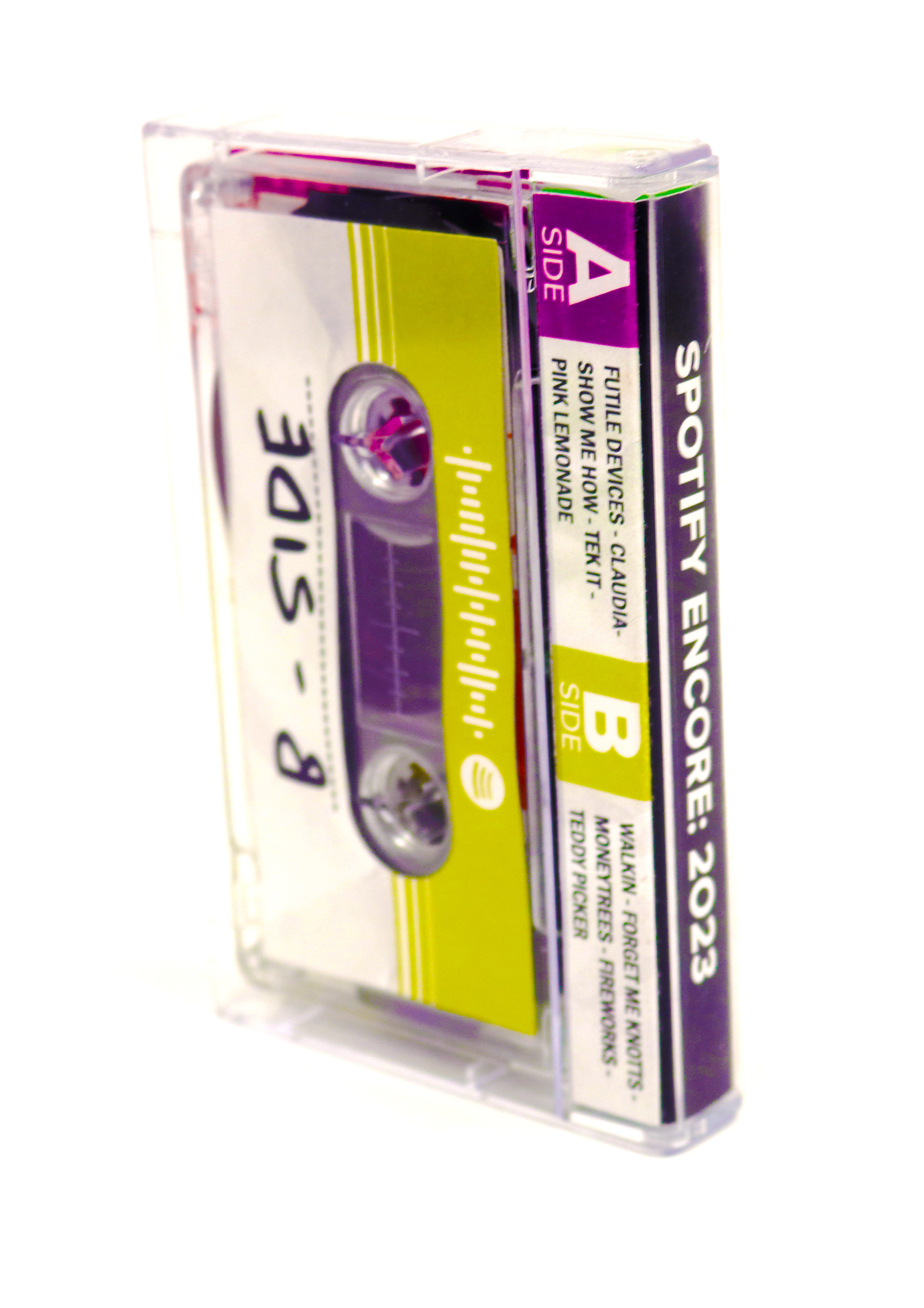
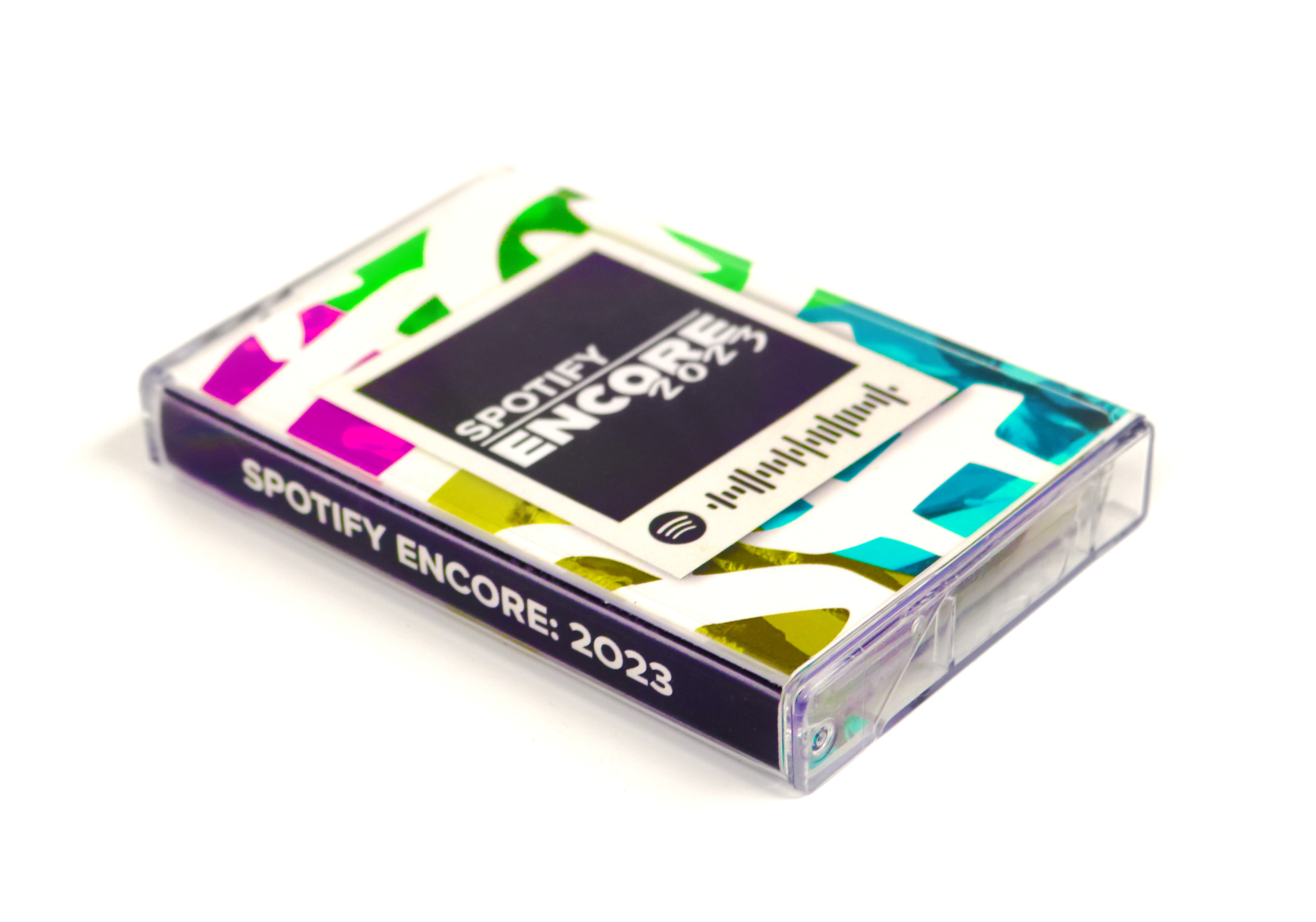
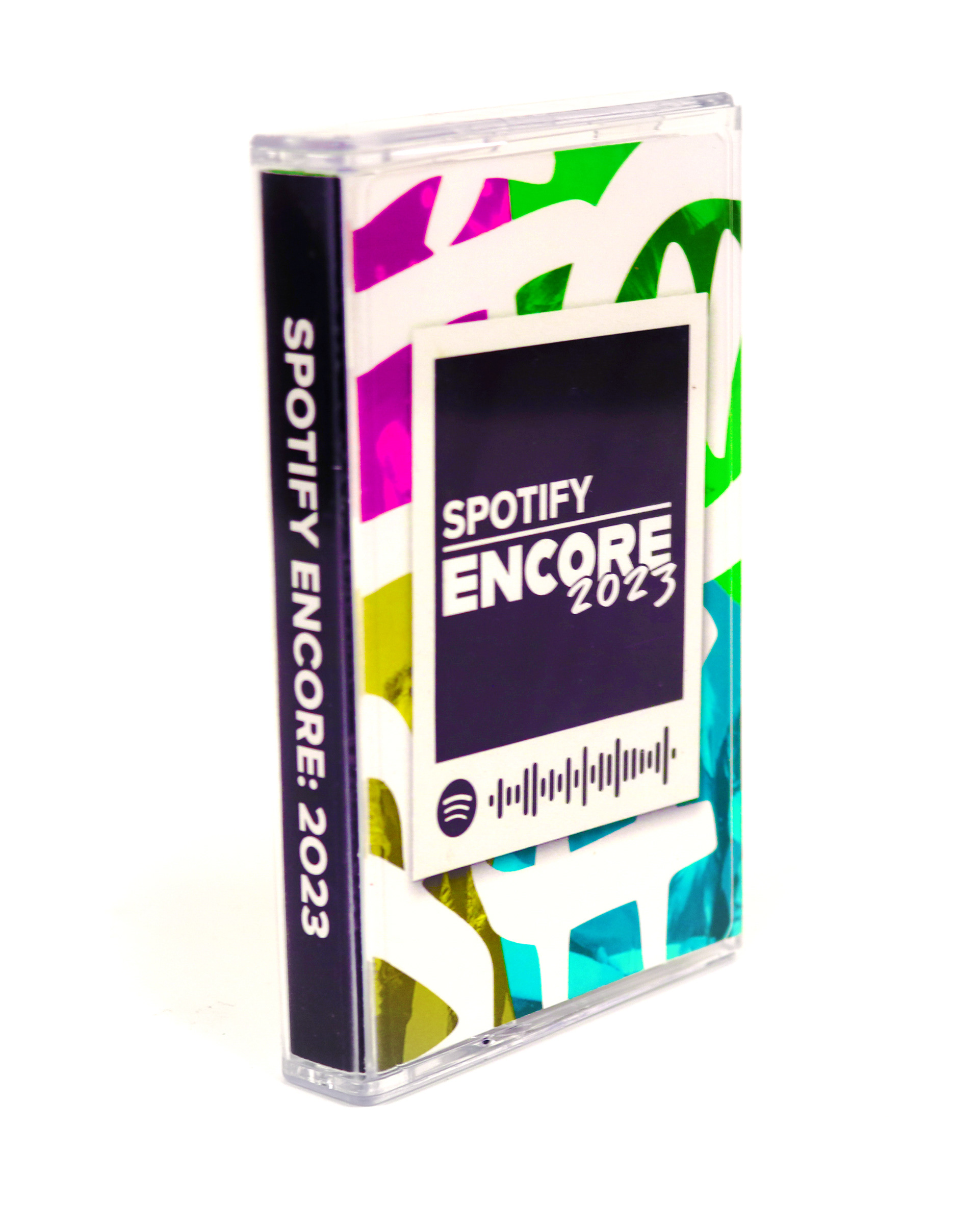
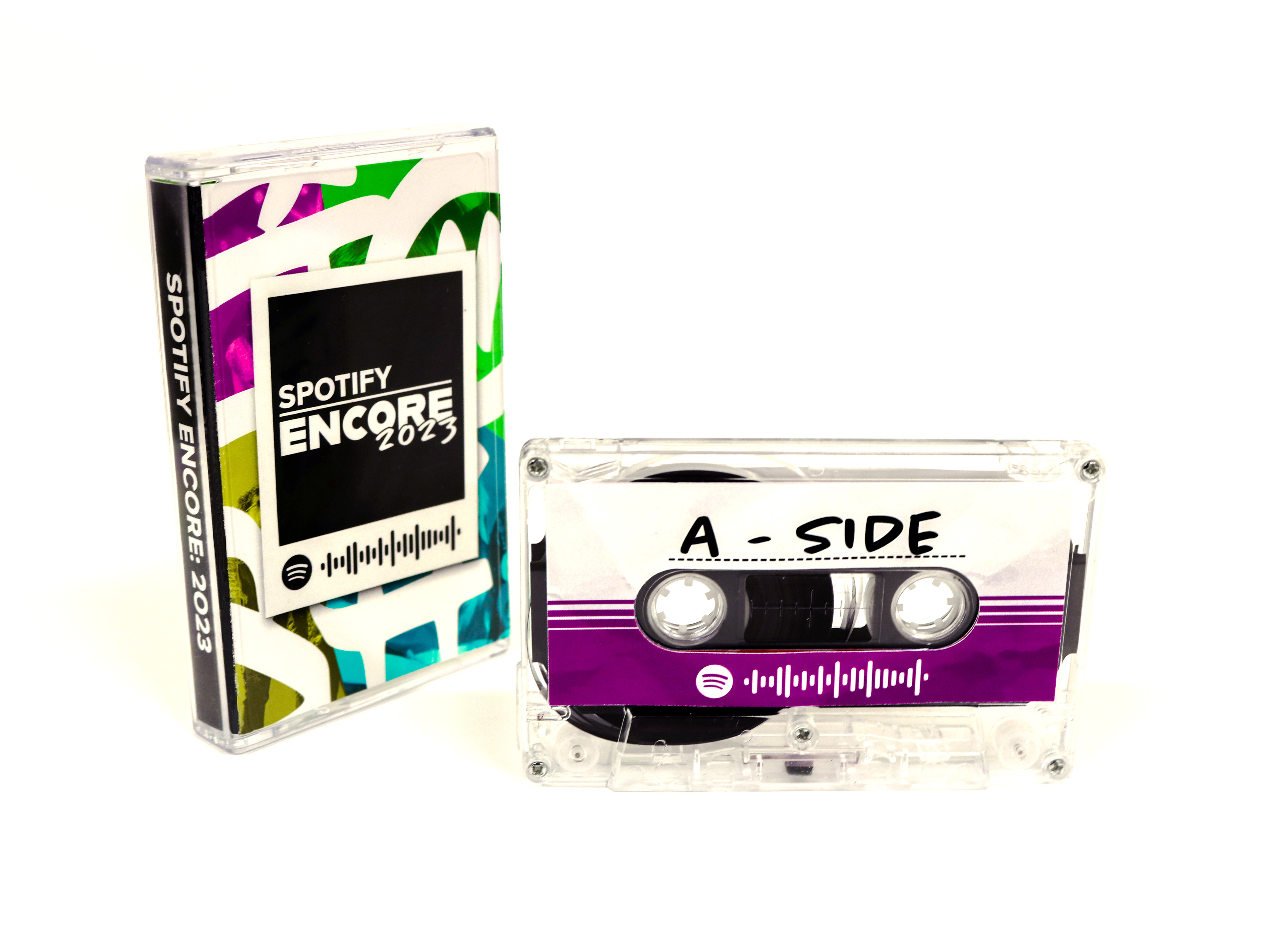


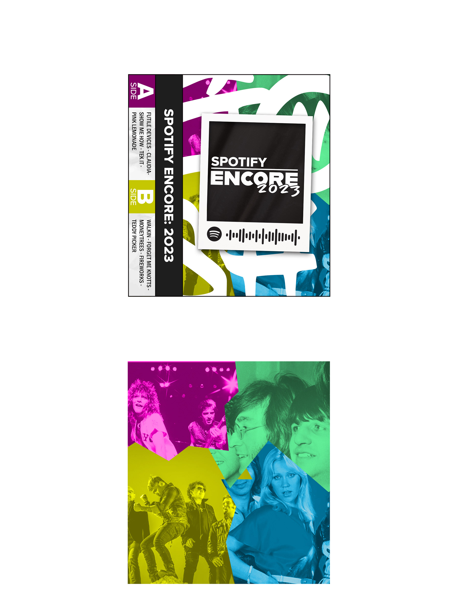
The cassette case was based on the 80's with secondary colors such as: violet and green, contrasting with primaries: blue and yellow.
The back of the case has the track list written horizontally with the A and B sides separated like the cassette tapes of the time. Moreover, the A and B side labels on the back line up with the backgrounds of the front to create a sense of cohesion. Additionally the colors violet and yellow were chosen to accentuate the contrast between the two sides as they are complimentary colors.
The tapes themselves have the code for the digital version of the playlist on them, and the A and B side labels are in a handwritten typeface on a dotted line to simulate homemade mixtapes.
CD Jewel Case
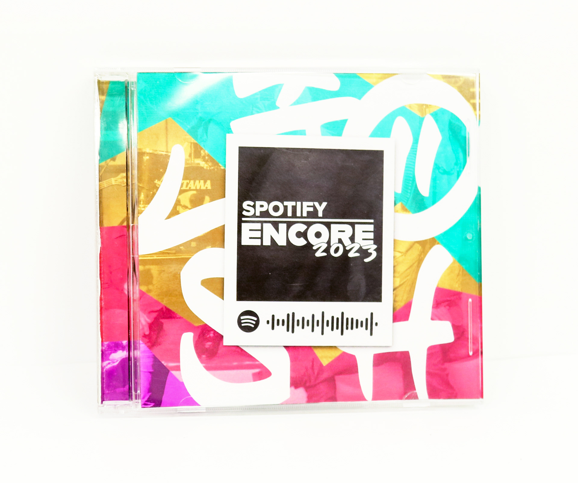

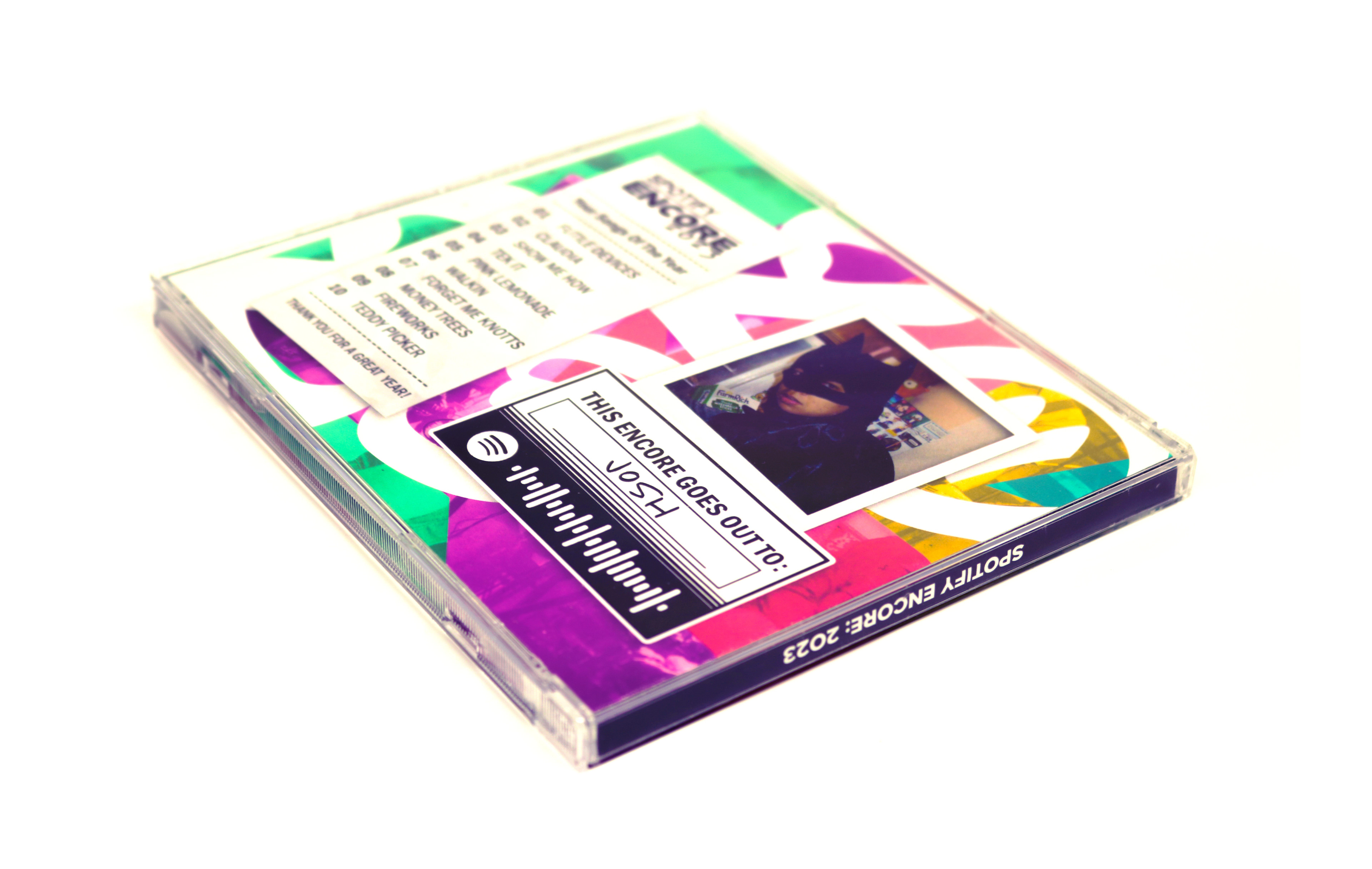
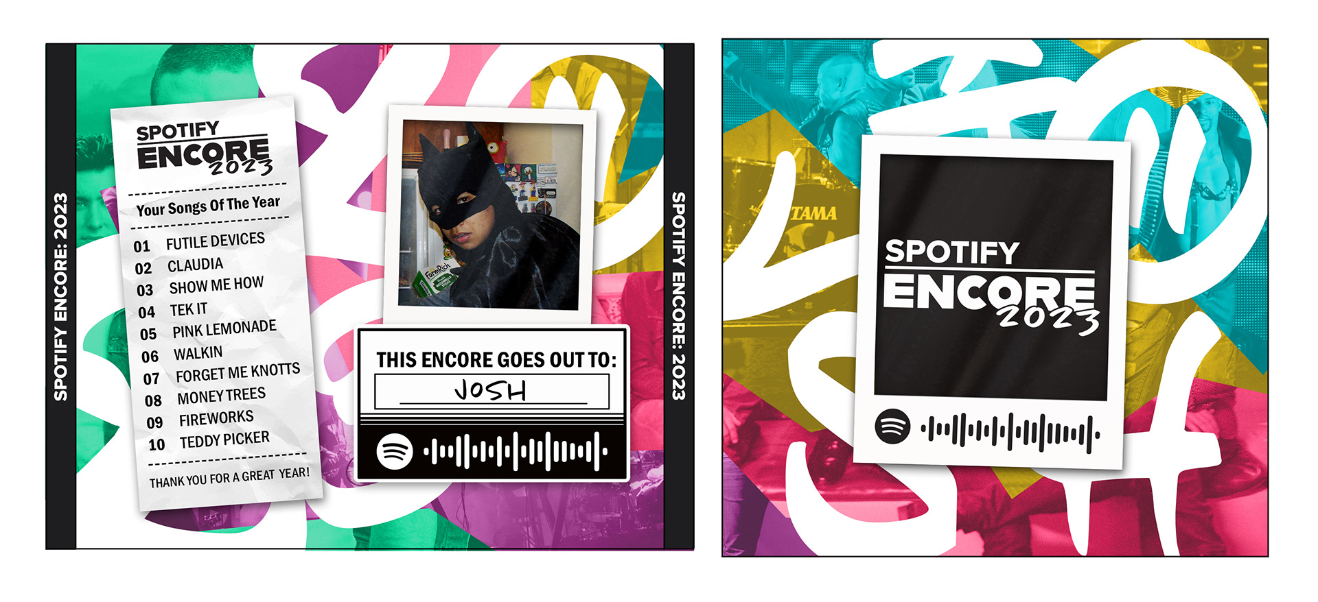
The CD Jewel Case was based on the 90's with brighter, neon, secondary colors and tertiary colors.
phone case
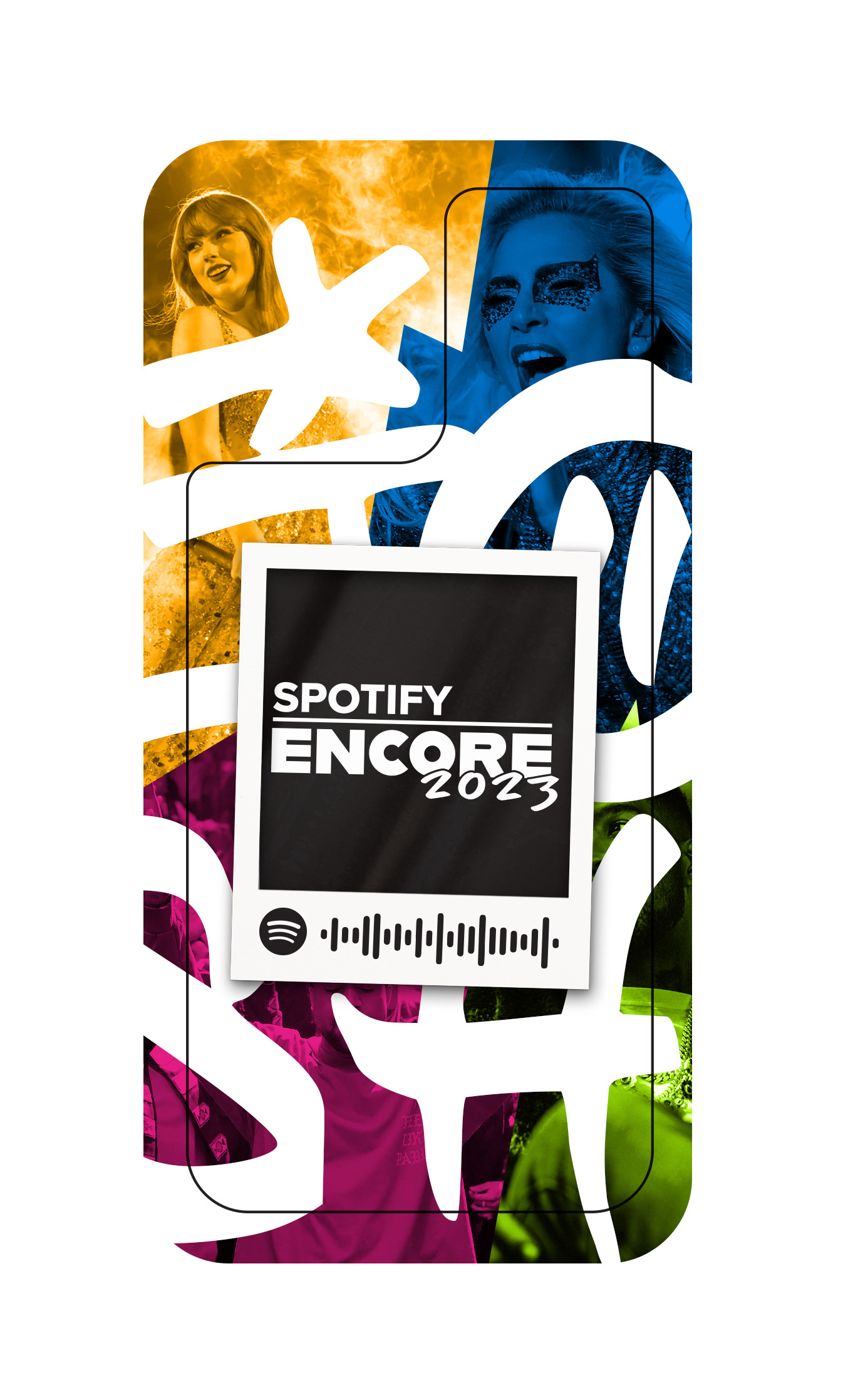
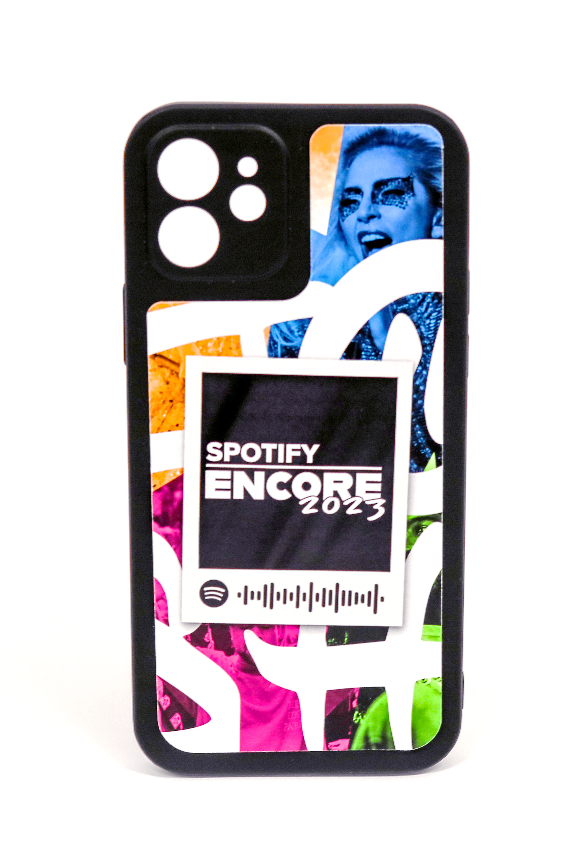
The phone case was based on the 2000's with bolder richer colors influenced by early iPod advertising.